
_
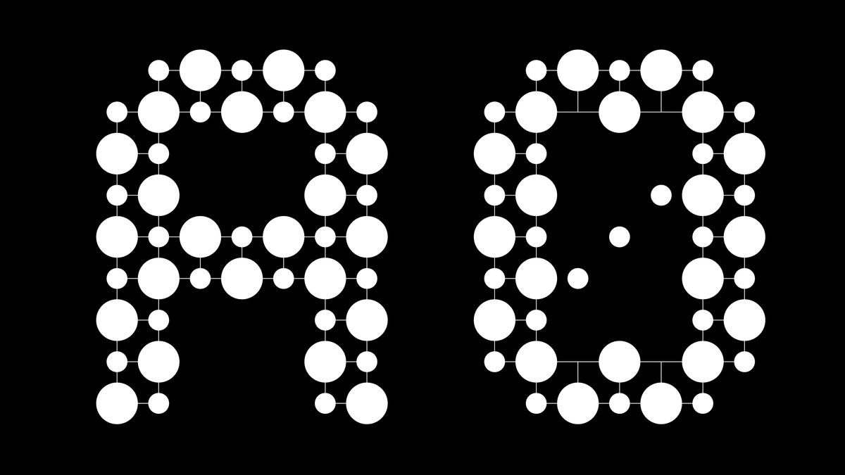
THD Senus | A new typeface design by THD in five cuts – roman, bold, roman curve, bold curve & roman shaded. This has been developed to fuse high contrast Modern typefaces with a functional design – the result has a contemporary feel (senus) with broad application.
THD Senus is now published & distributed by Monotype & is available at Myfonts.com

—
—
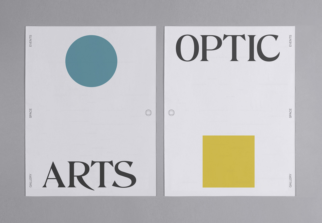
Brand identity & promotional design for the new events arts group & gallery. The identity incorporates THD_Liberty typeface as part of the main brand identity elements.

—
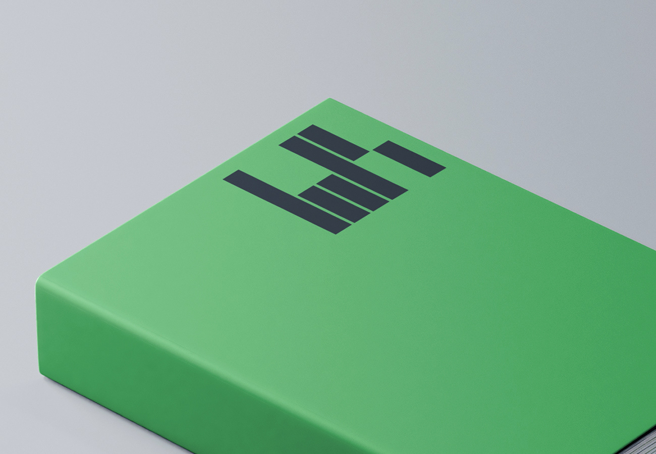
Identity & branding for the new leading consultancy agency Six Ravens
—
—
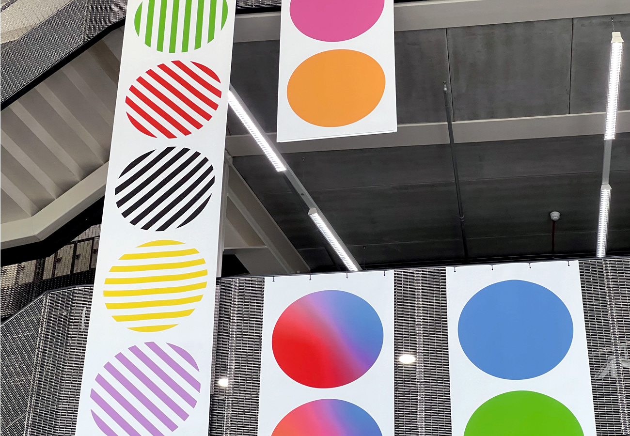
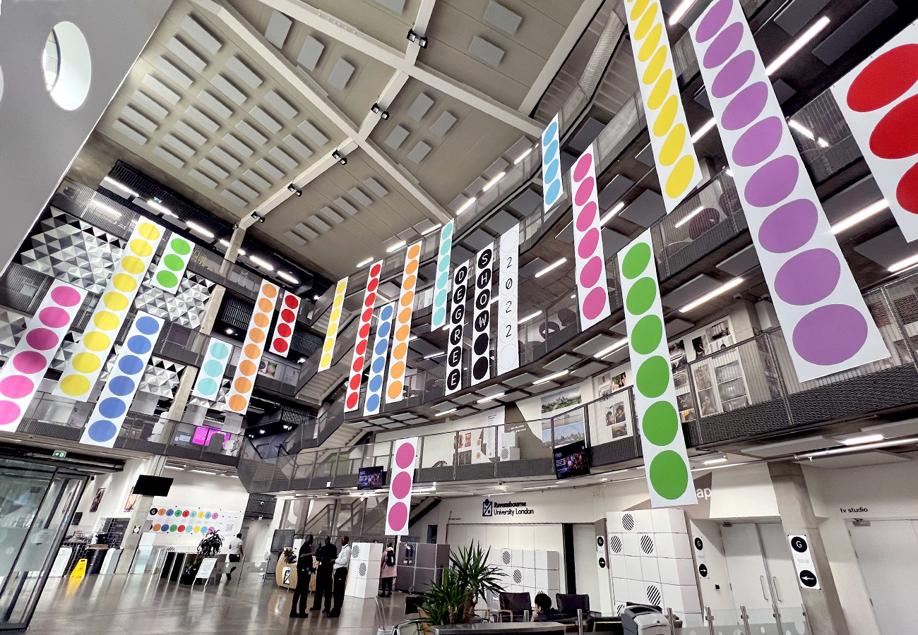
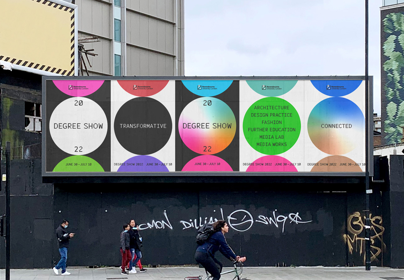
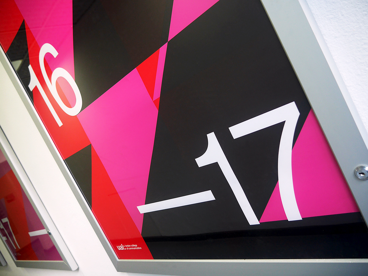
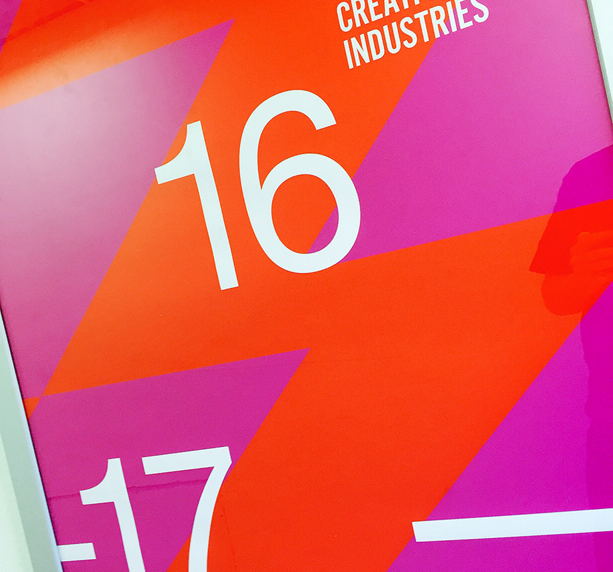
Identity & exhibition design for Ravensbourne University 2022 Degree Show. An integrated solution including way-finding, bespoke display system, promo material plus atrium super-graphics to energise the campus.
—
—
—
—
Editorial design for the new C+H Typographic Research group
_
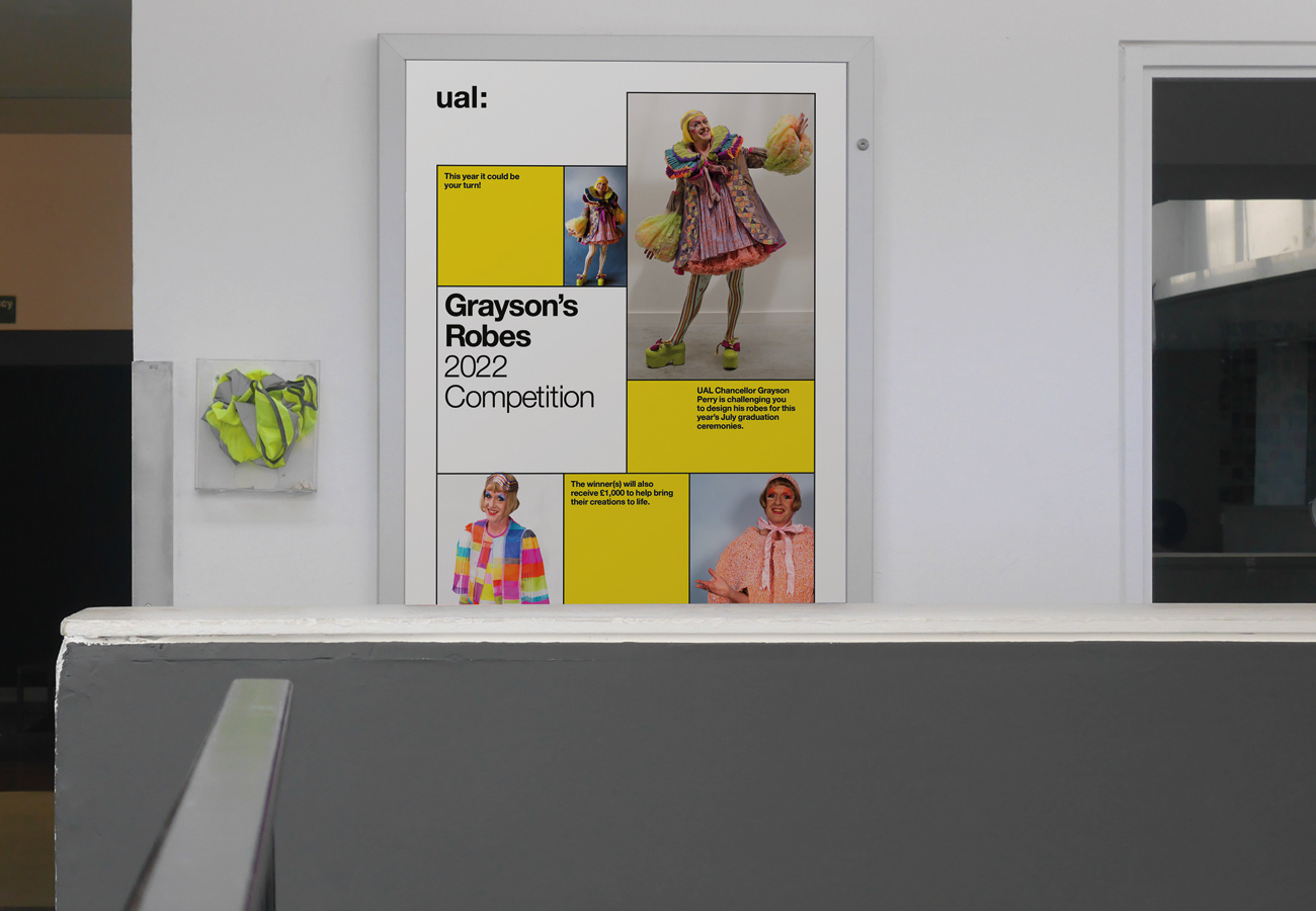
A new campaign design for the 2022 competition 'Grayson's Robes' at UAL
—
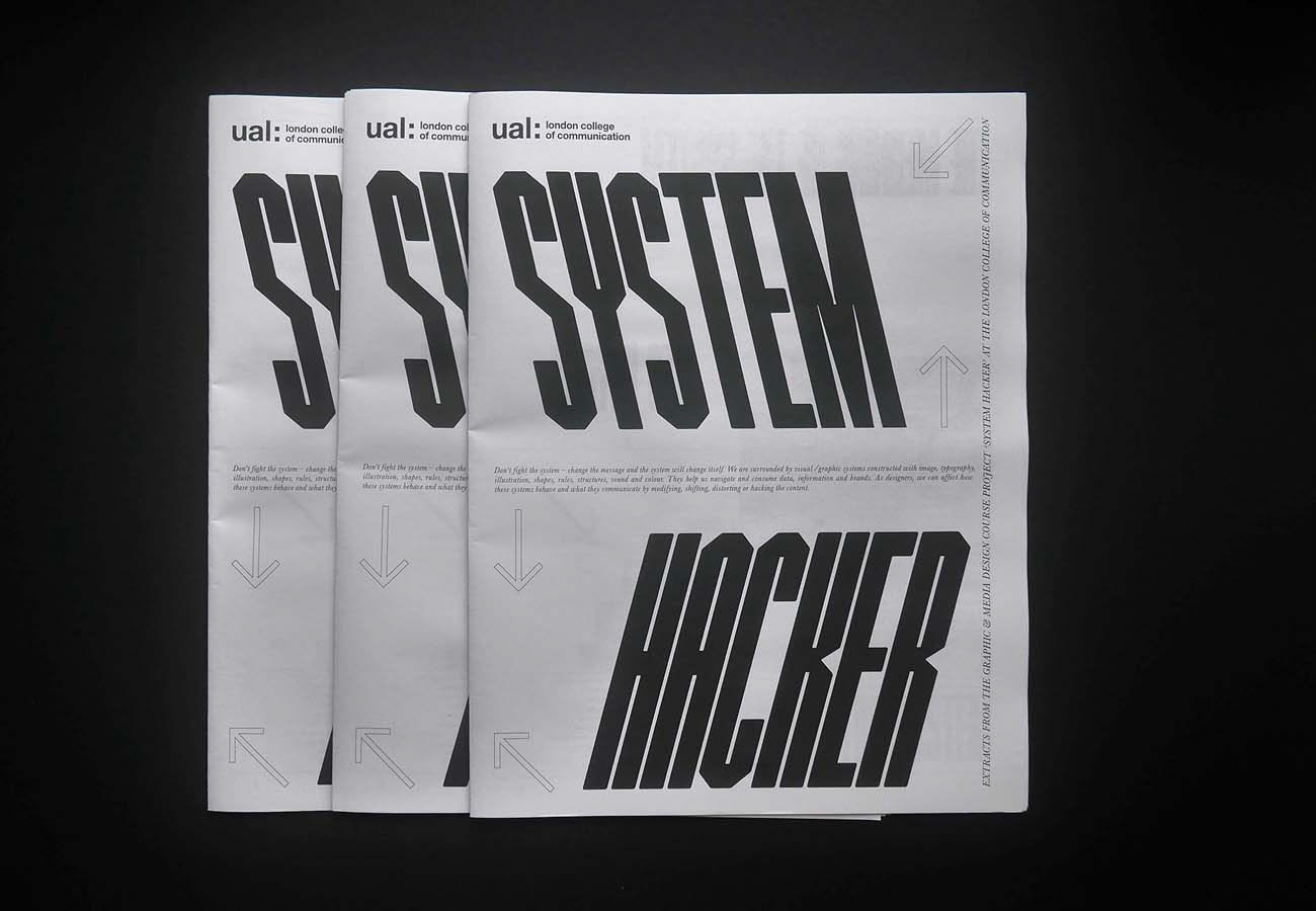
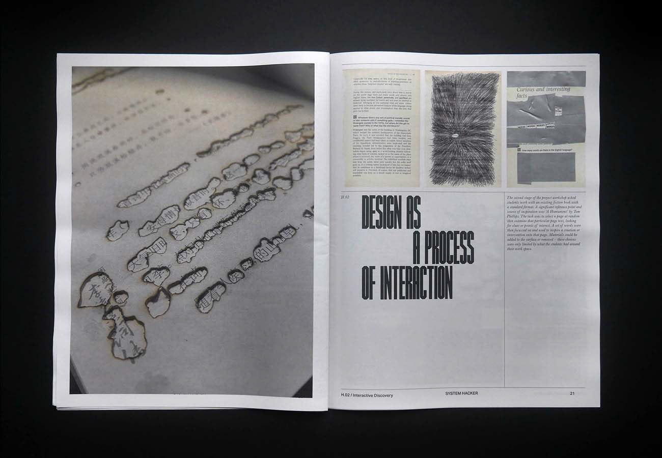
New editorial design for the GMD course at LCC/UAL
_
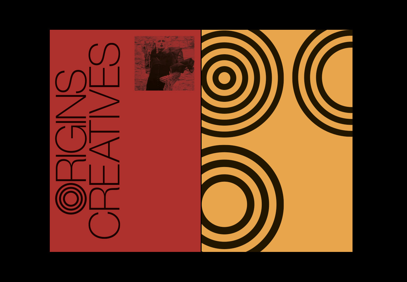
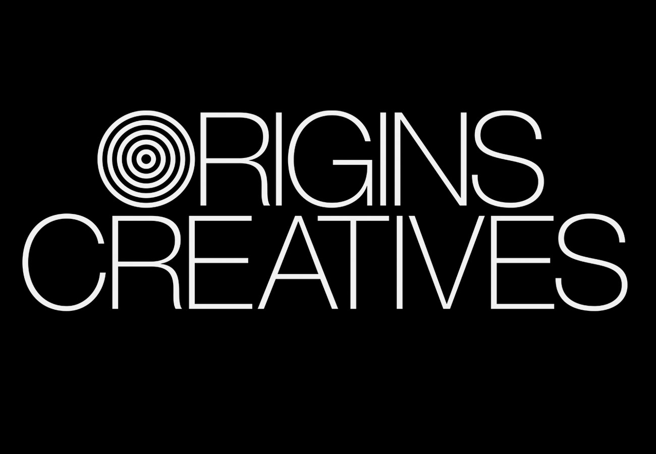
Branding and Identity design for the annual exhibition 'Origins Creatives'. The show aims to shine a light on diverse, creative talent from across the UK.
_
—
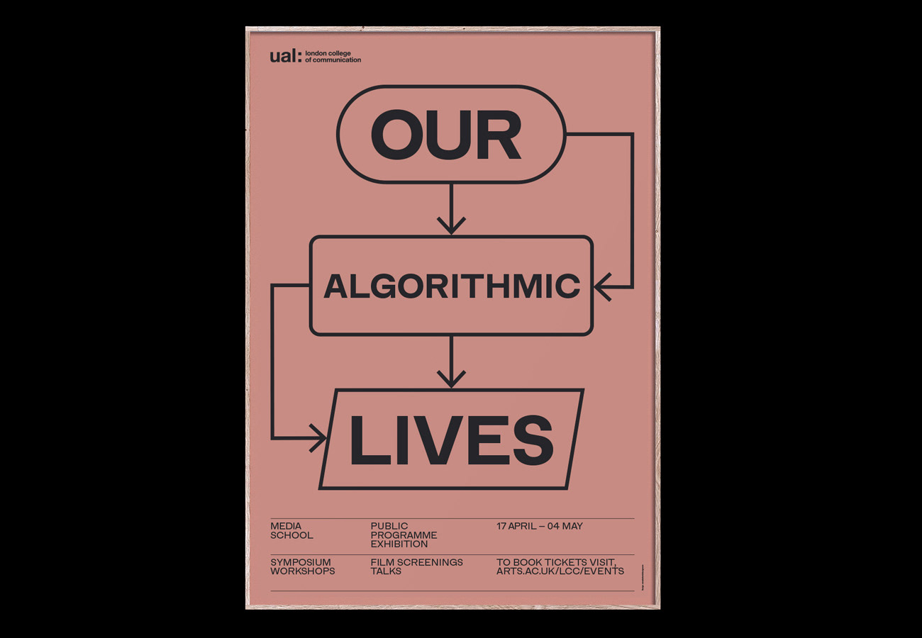
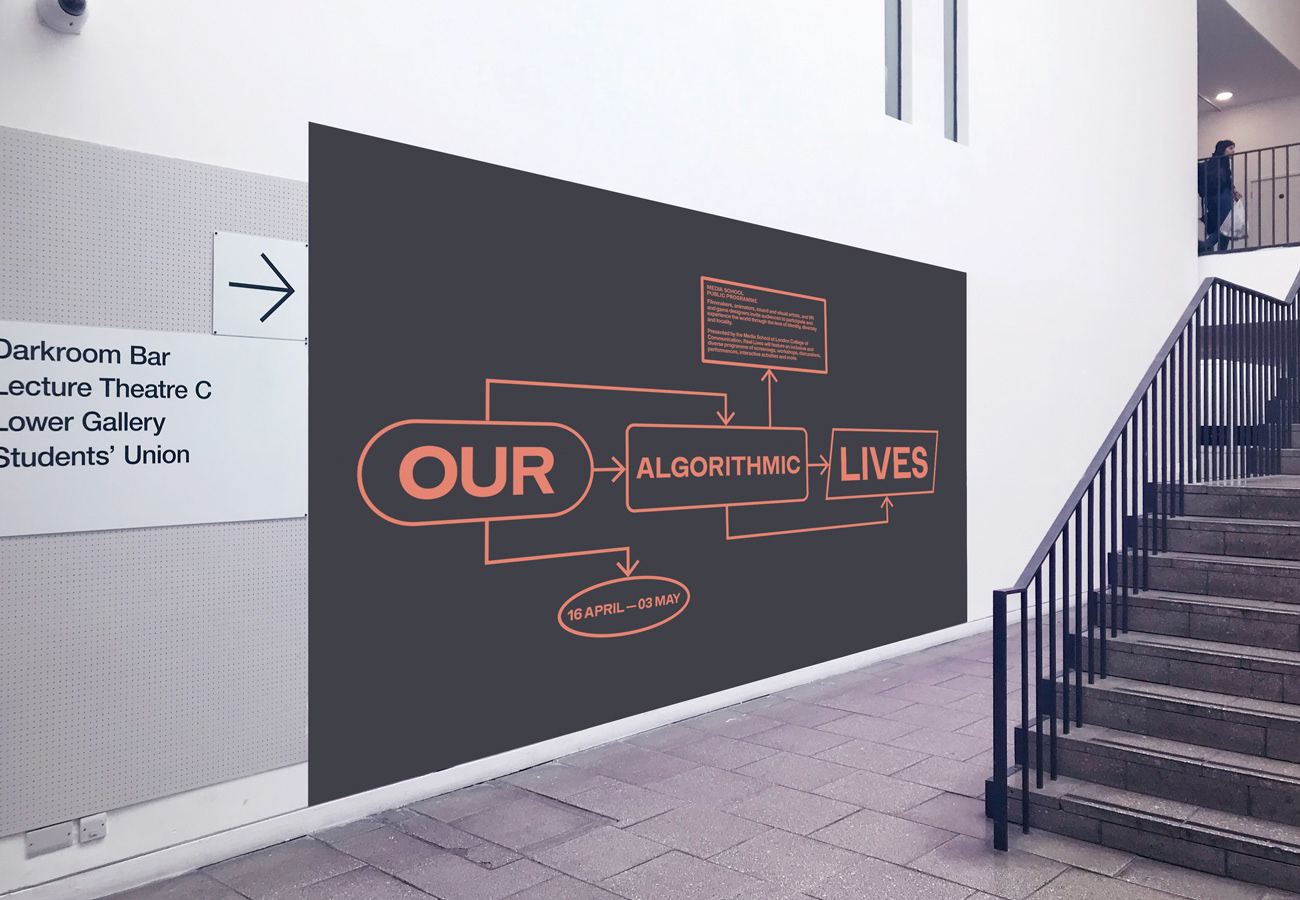
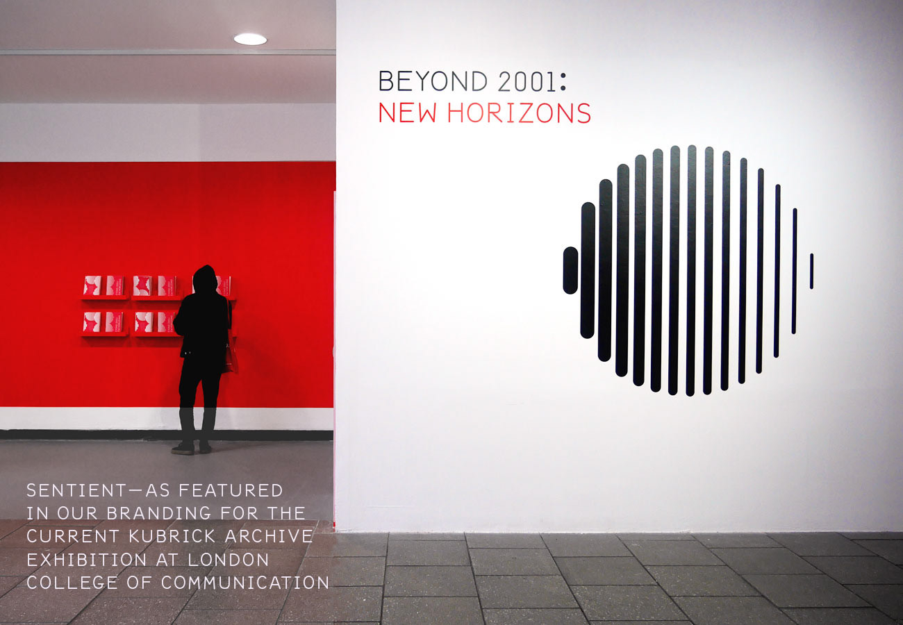
Branding and identity design for 'Our Algorithmic Lives' exhibition at UAL
—
_
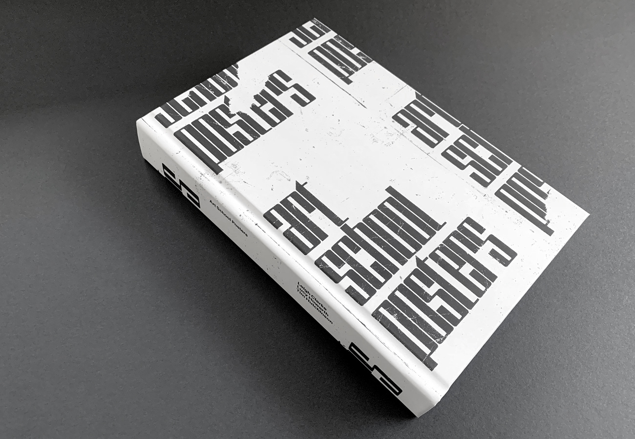
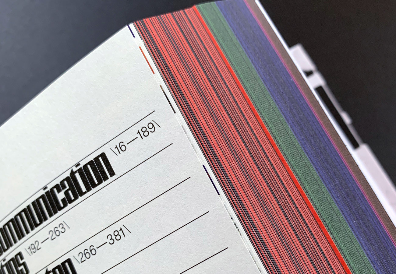
Art School Posters – Editorial design
—
_
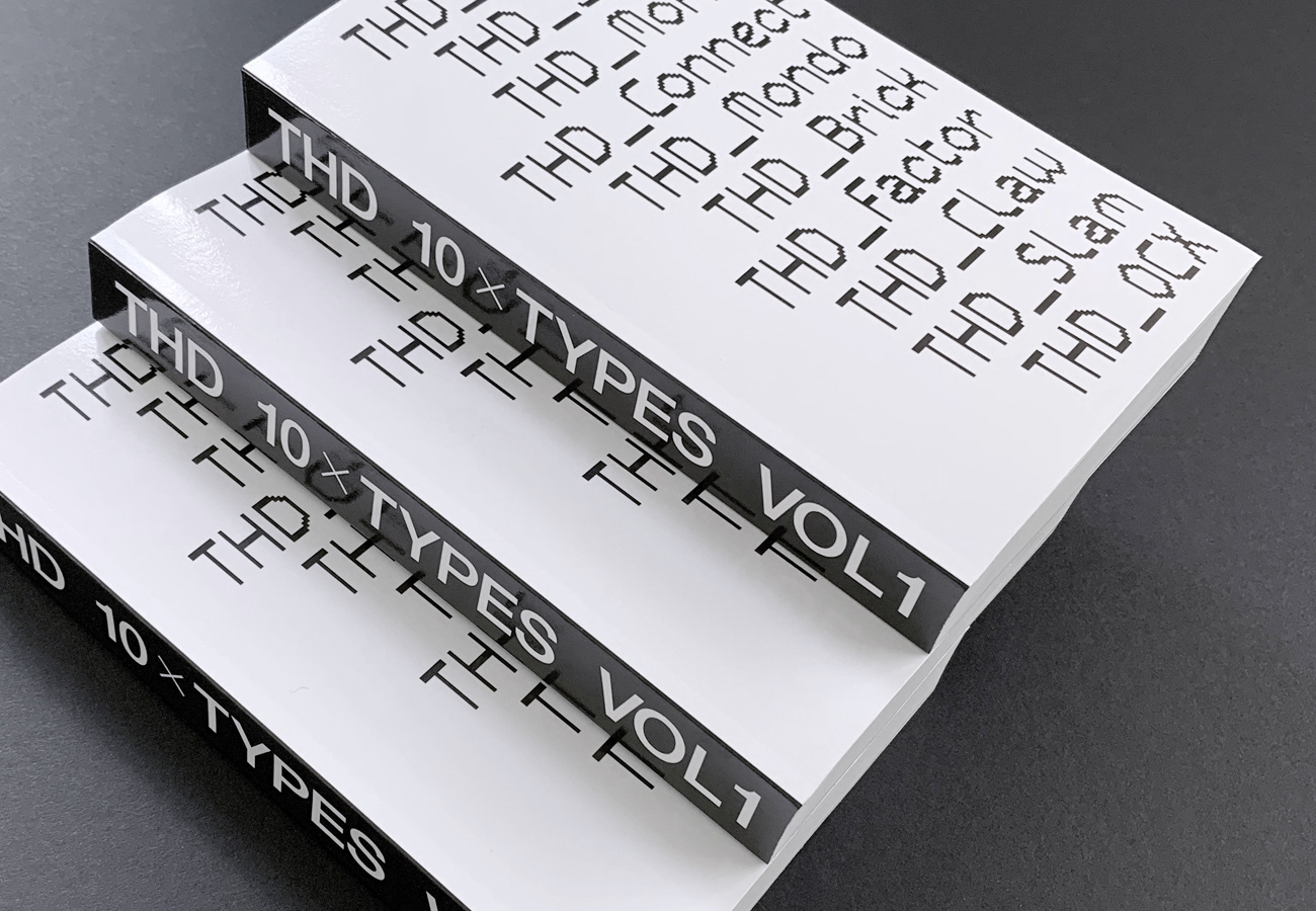
Volume 1 of the THD type design catalogue
_
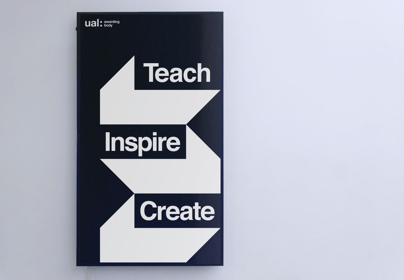
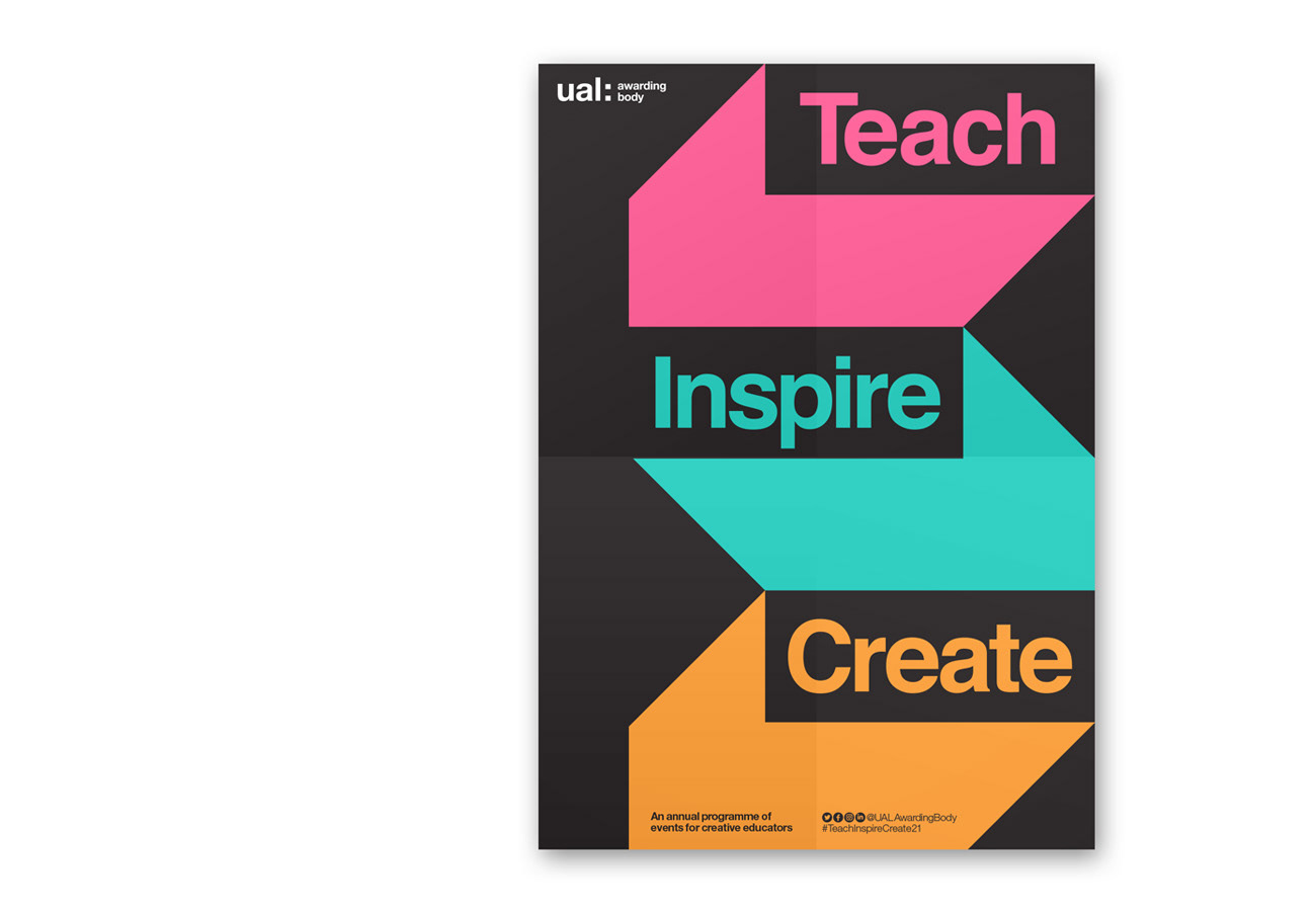
Identity design and campaign applications for the new 2021 teaching conference for UAL's Awarding Body.

_
_
_
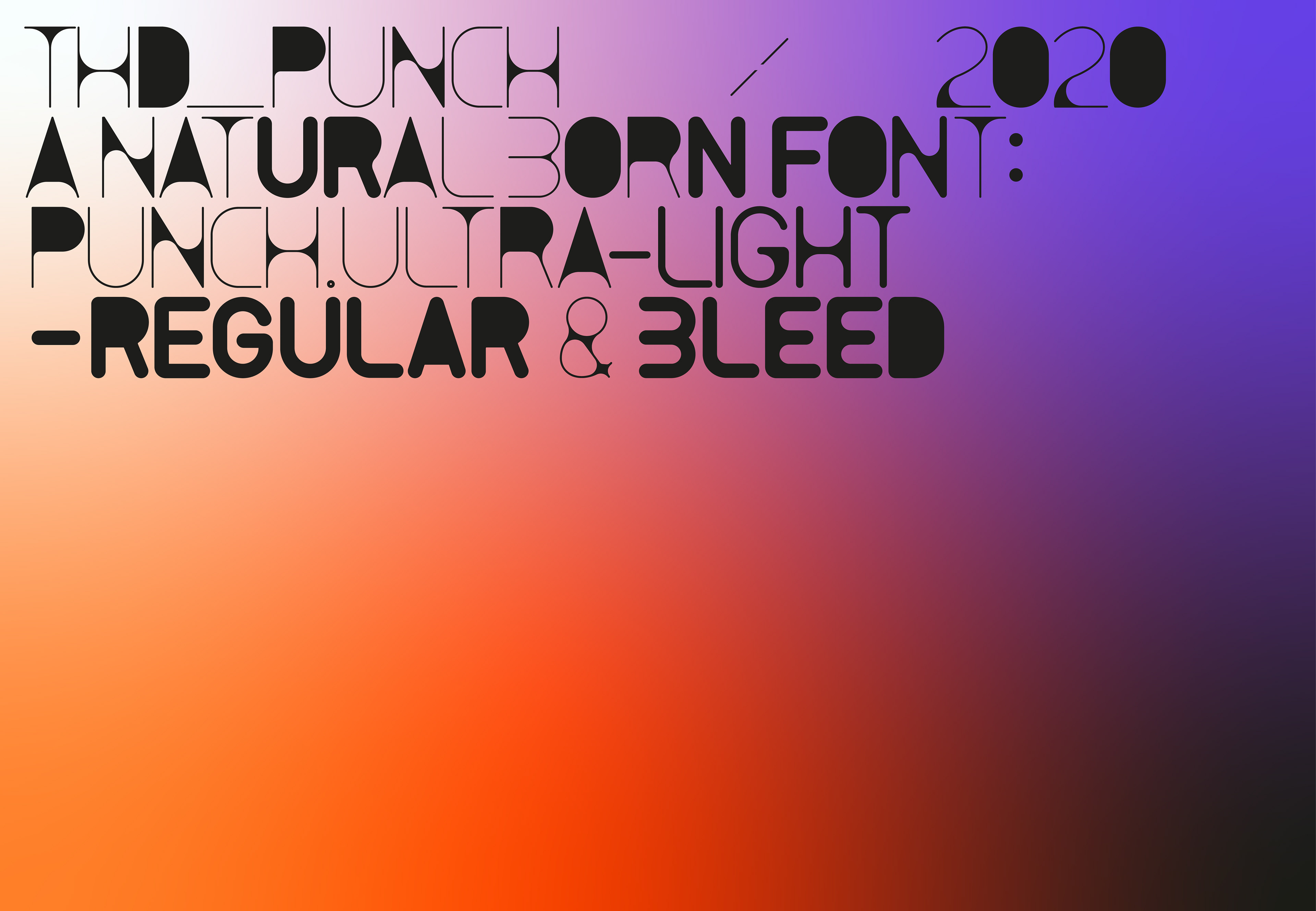
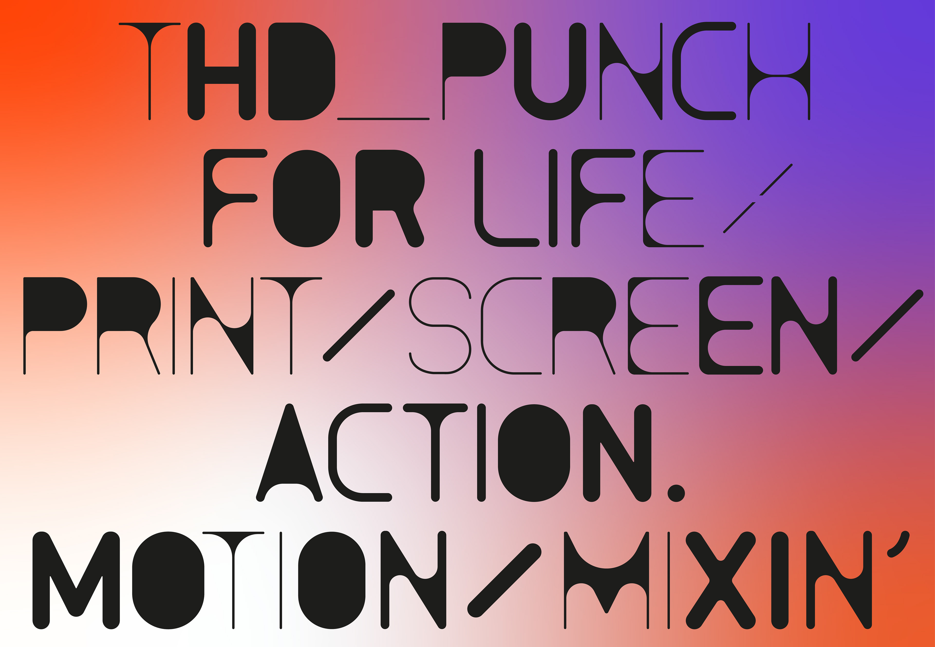
THD_Punch is a new typeface inspired by original architect blueprint stencils. The typeface comes in a series of weights that reflects the bleed & flow of the inks in this analogue process.
_
—
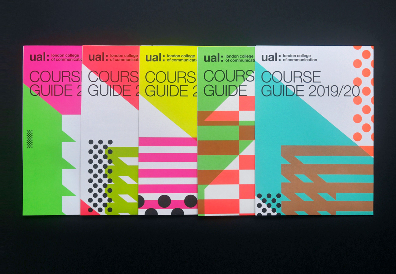
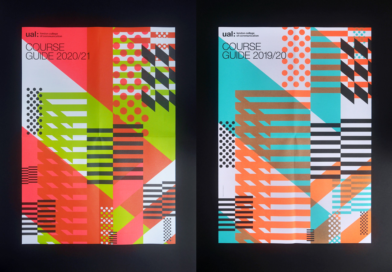
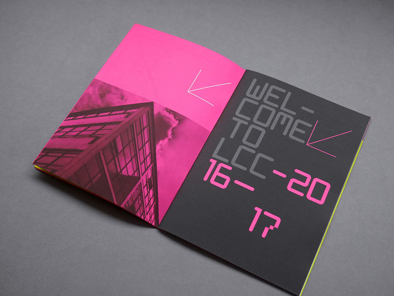
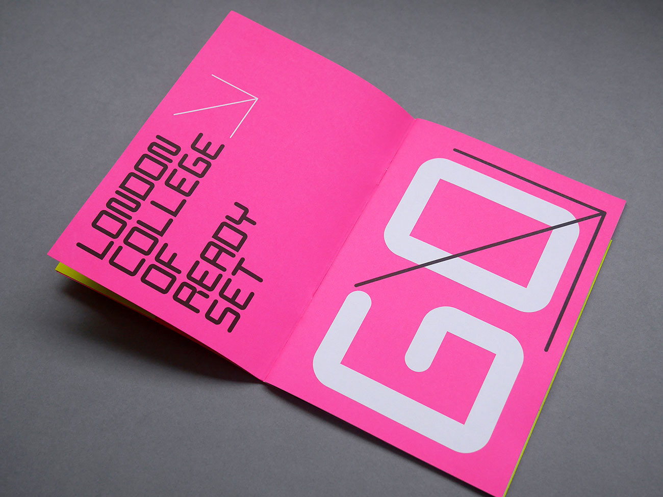
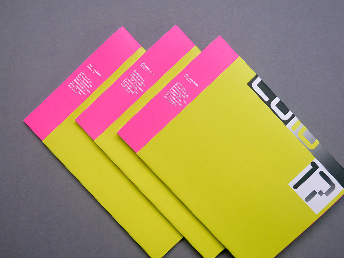
Promotion brand design for LCC—a series of course guides with abstracted elements of the college building and surrounding architecture. The approach aims to reflect not only the energy of the college but also the vibrant environment where it's located.
—
_
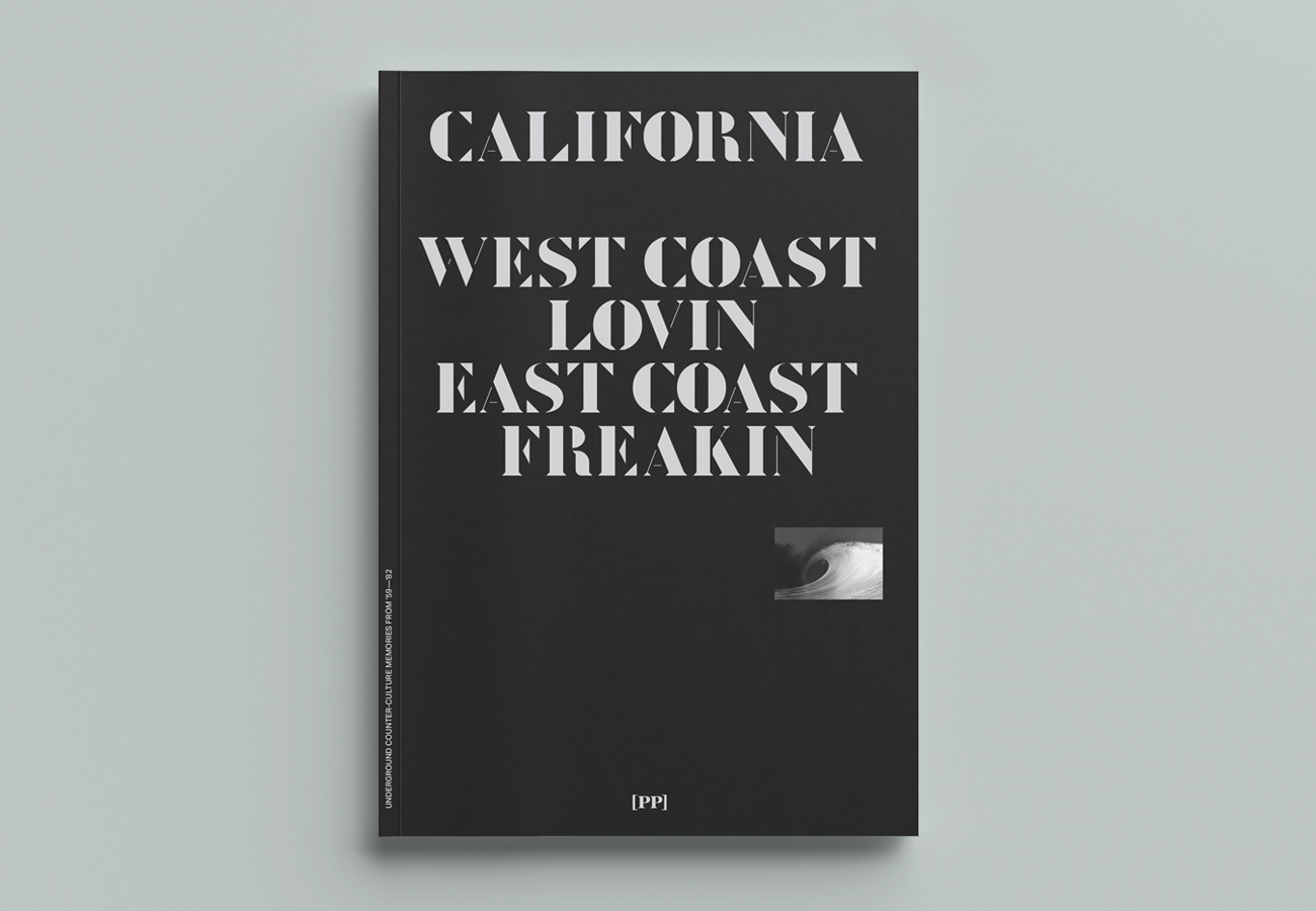
Book cover design for PP publishing—the brief required a design approach to reflect the 'underground' nature of the content, the dark tones are a deliberate contrast to the stereotypical 'California' imagery.
_
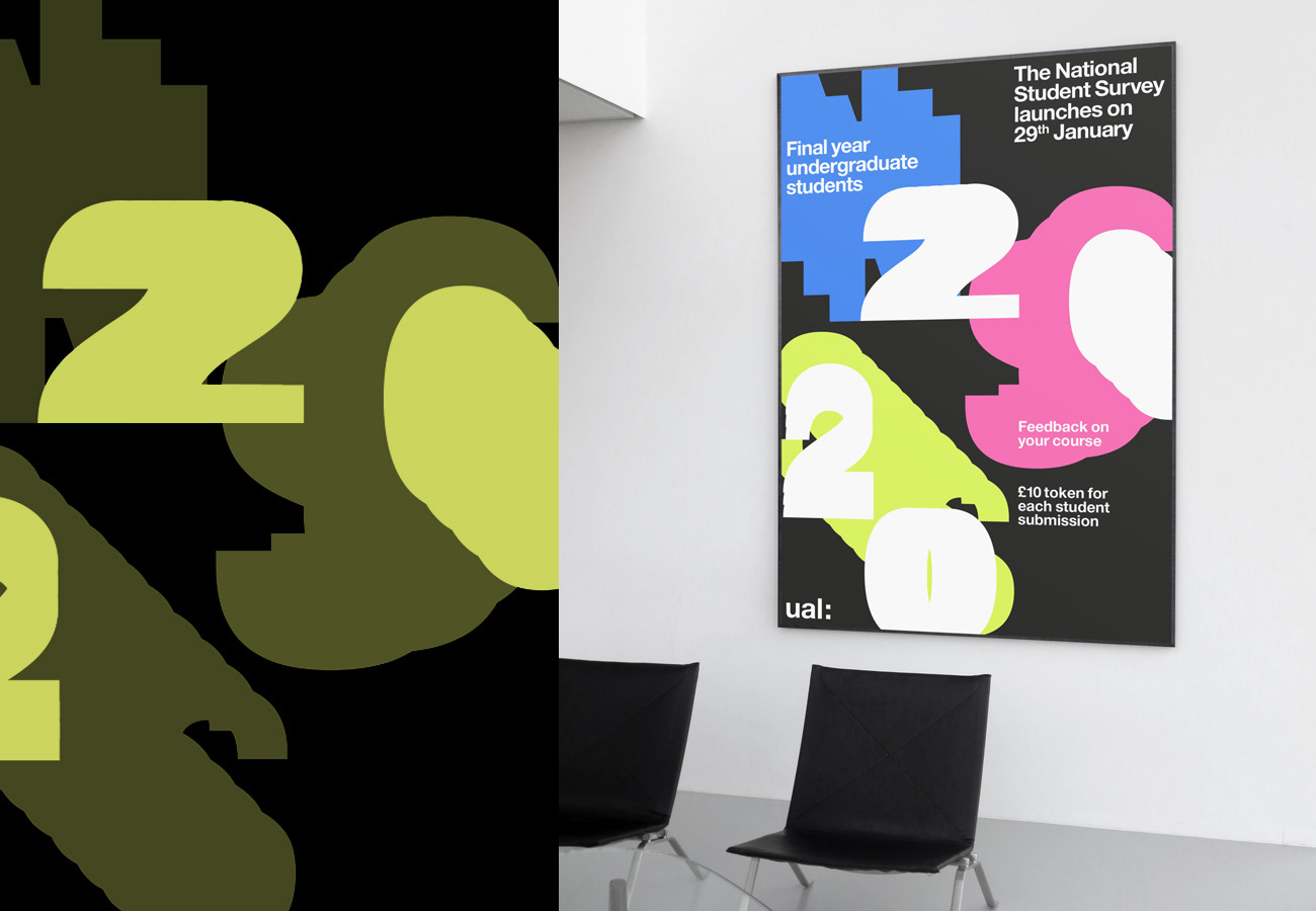
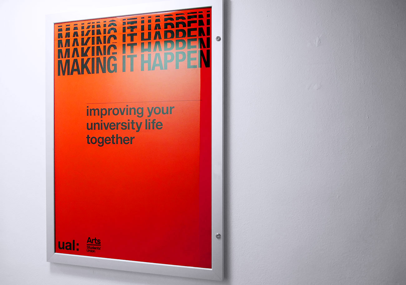
Print & screen integrated campaign to encourage feedback on courses across UAL.
_
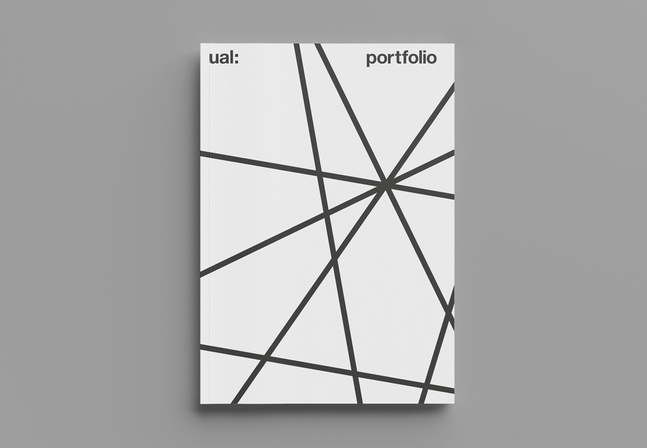
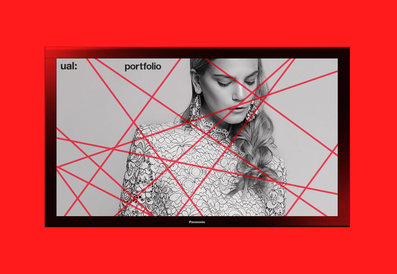
A new identity and campaign material for the new Portfolio at UAL. A platform for networking and collaborating between creatives, designers and artists.
—
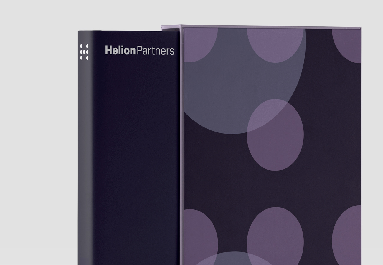
New branding and identity design for Helion Partners, a media investment and mergers company
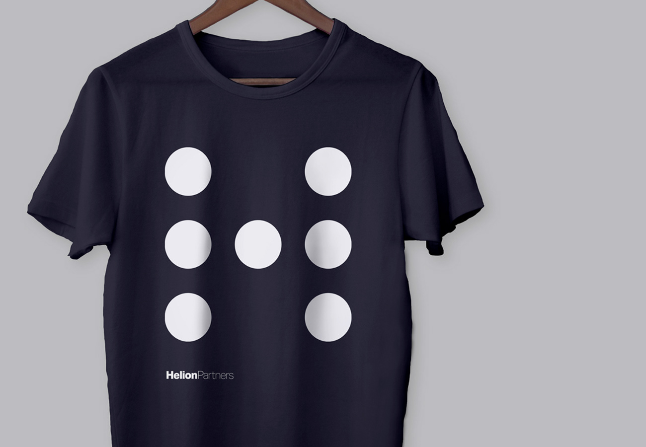
Apparel application of the identity design for Helion Partners
—
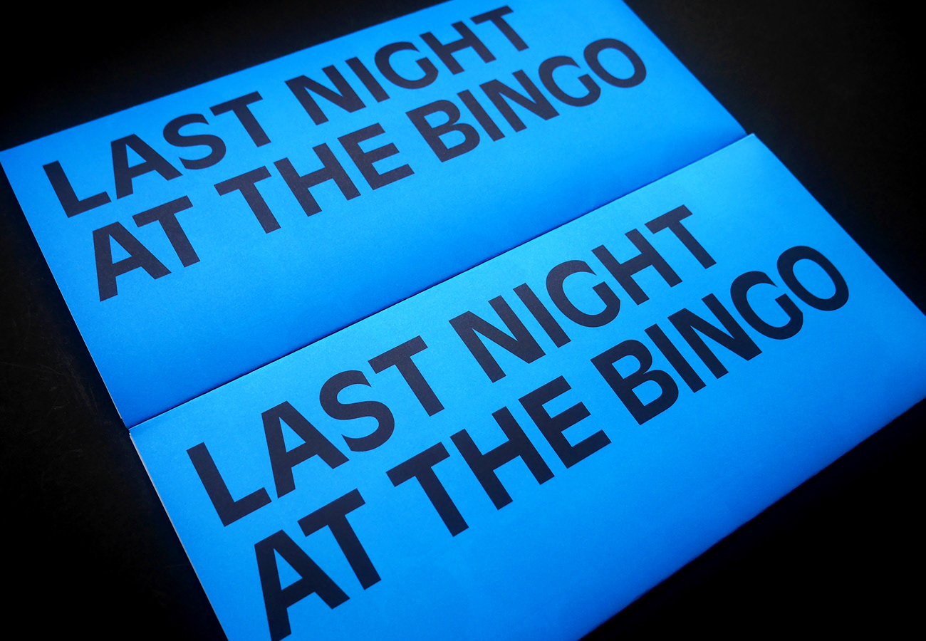
Catalogue and promotional design for artist Leigh Clarke's, 'Last Night at the Bingo'. Exhibited at Margate Now Festival 2019.
—
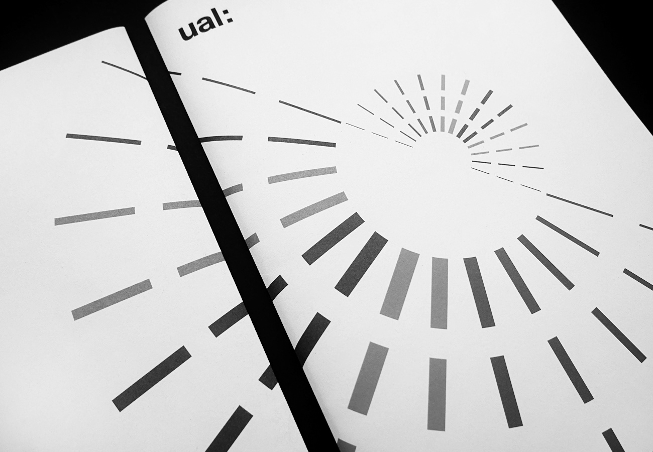
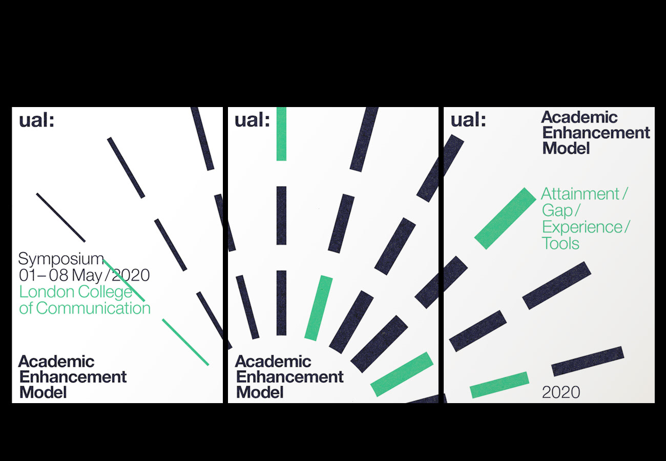
A new identity system for the Academic Enhancement Model (AEM) for UAL. The identity communicates the different channels of support, information and toolkits available for academic staff to assist in developing teaching structures that enable greater levels of achievement within student cohorts. The identity aims to create a positive snd dynamic graphic image to promote the ambitions of this initiative.
—
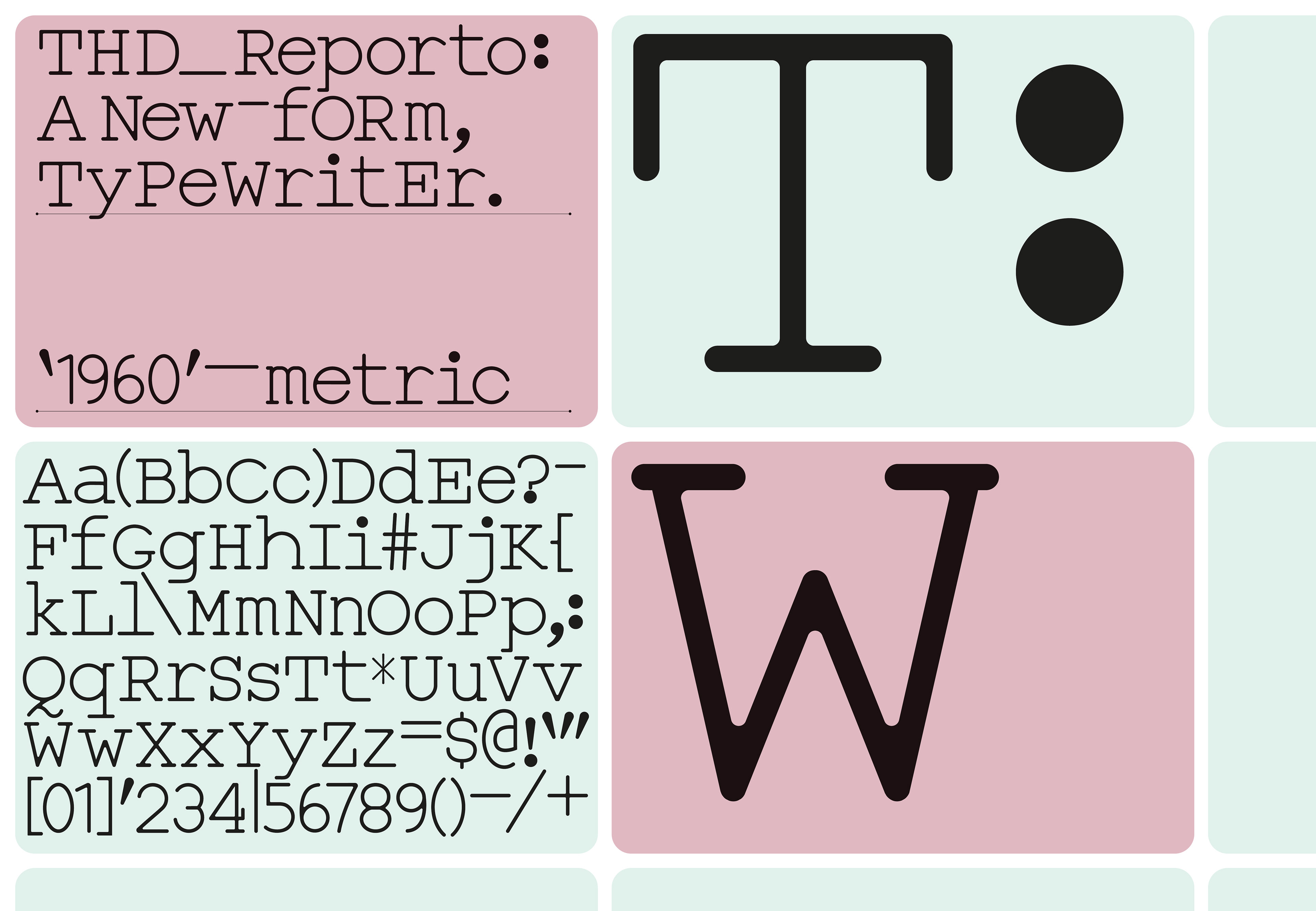
'THD_Reporto'—bespoke typeface design for a cultural publication
—
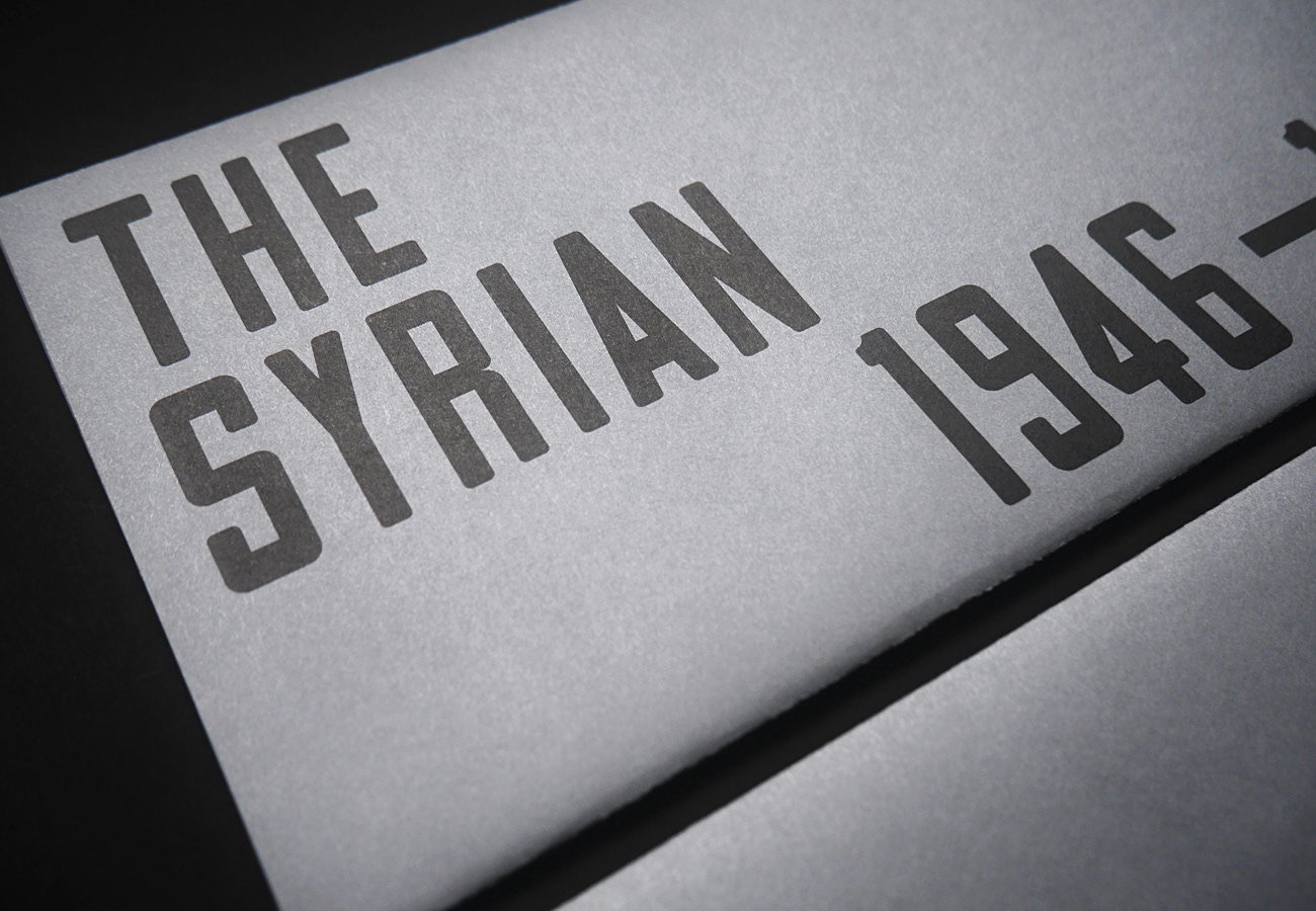
Catalogue design and bespoke typeface creation for artist Leigh Clarke's,'The Syrian', exhibited at the Whitstable Biennale.
_
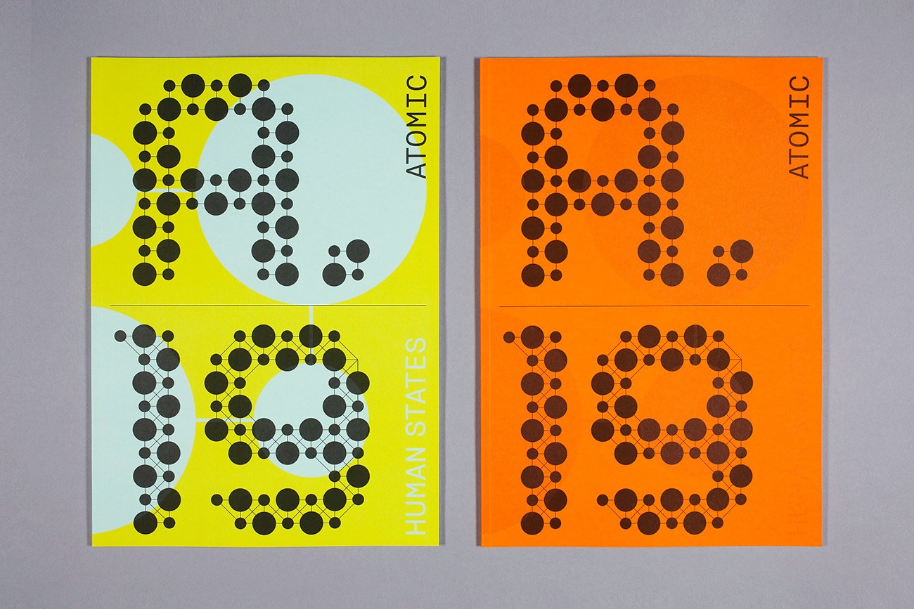
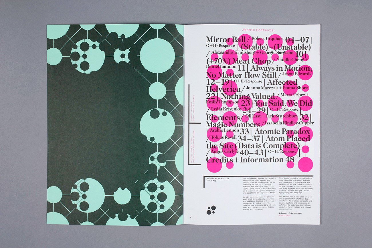
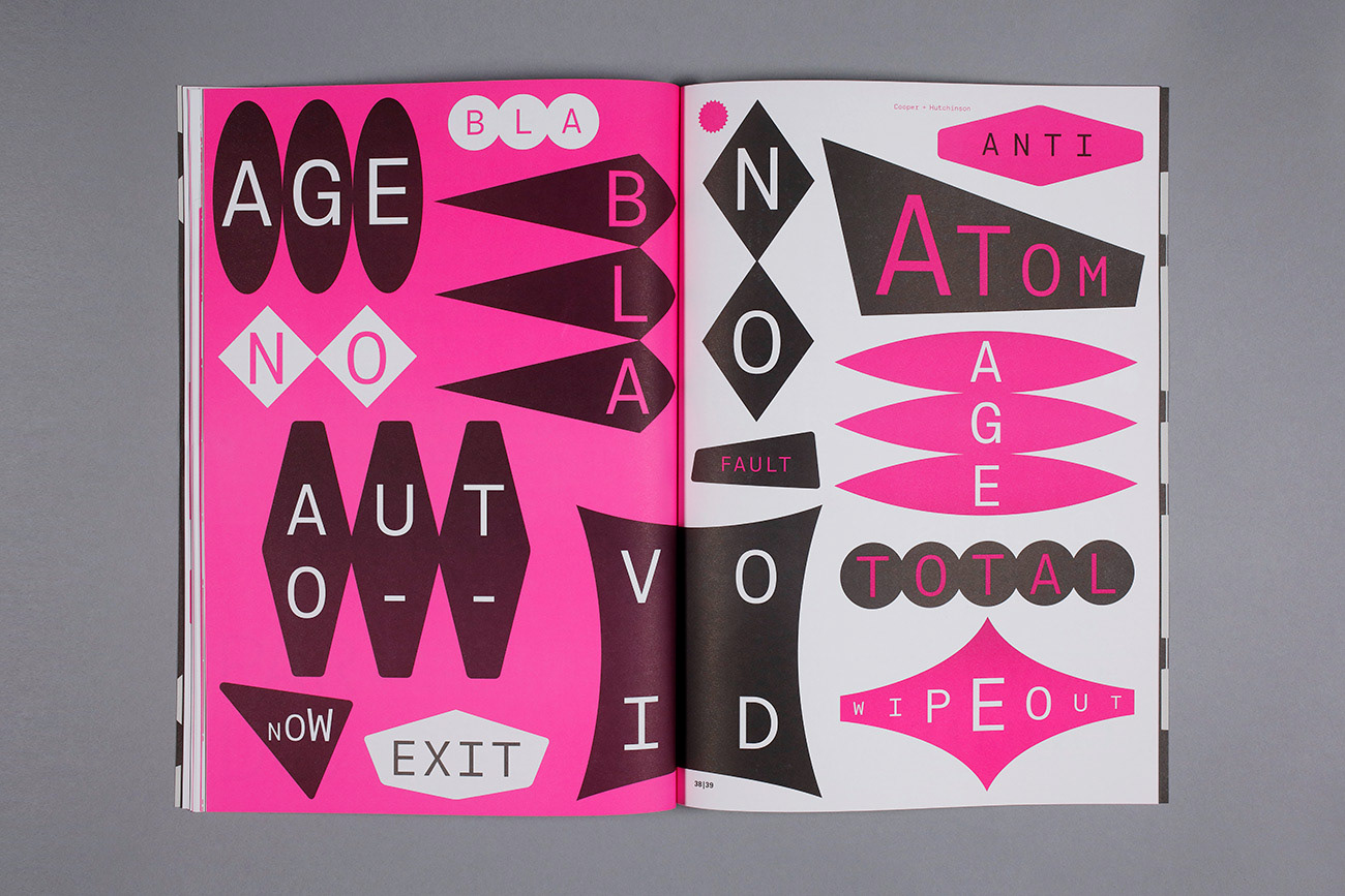
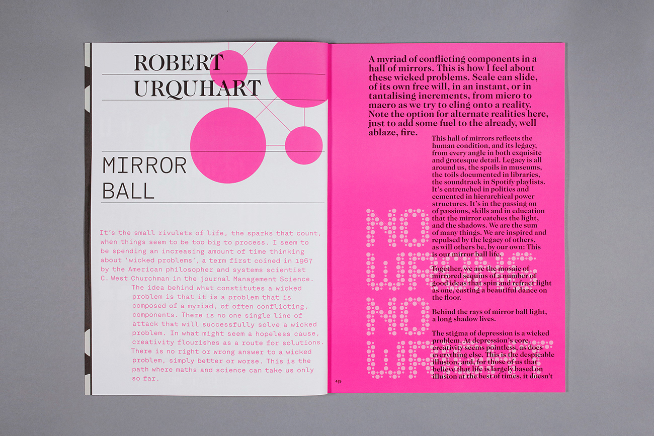
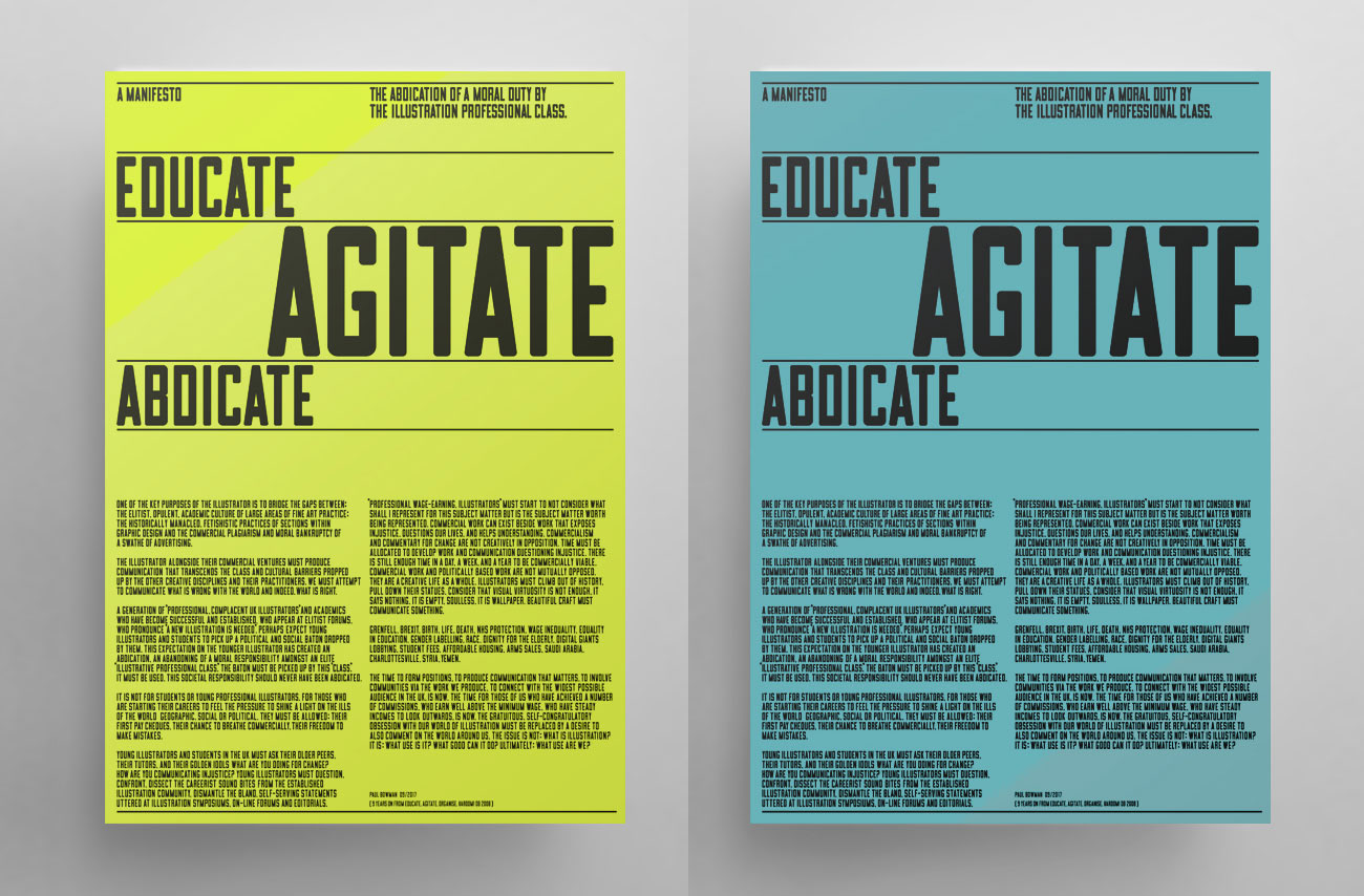
Issue #03 of the Im-Pressed series entitled 'Atomic'. Designed, edited and produced by Tim Hutchinson Design and Alex Cooper with contributions from a range of writers and designers. This issue explores the atomic theme against a backdrop of sustainability and climate change. Relevant history and human values are interrogated through the use of typography and language.
—
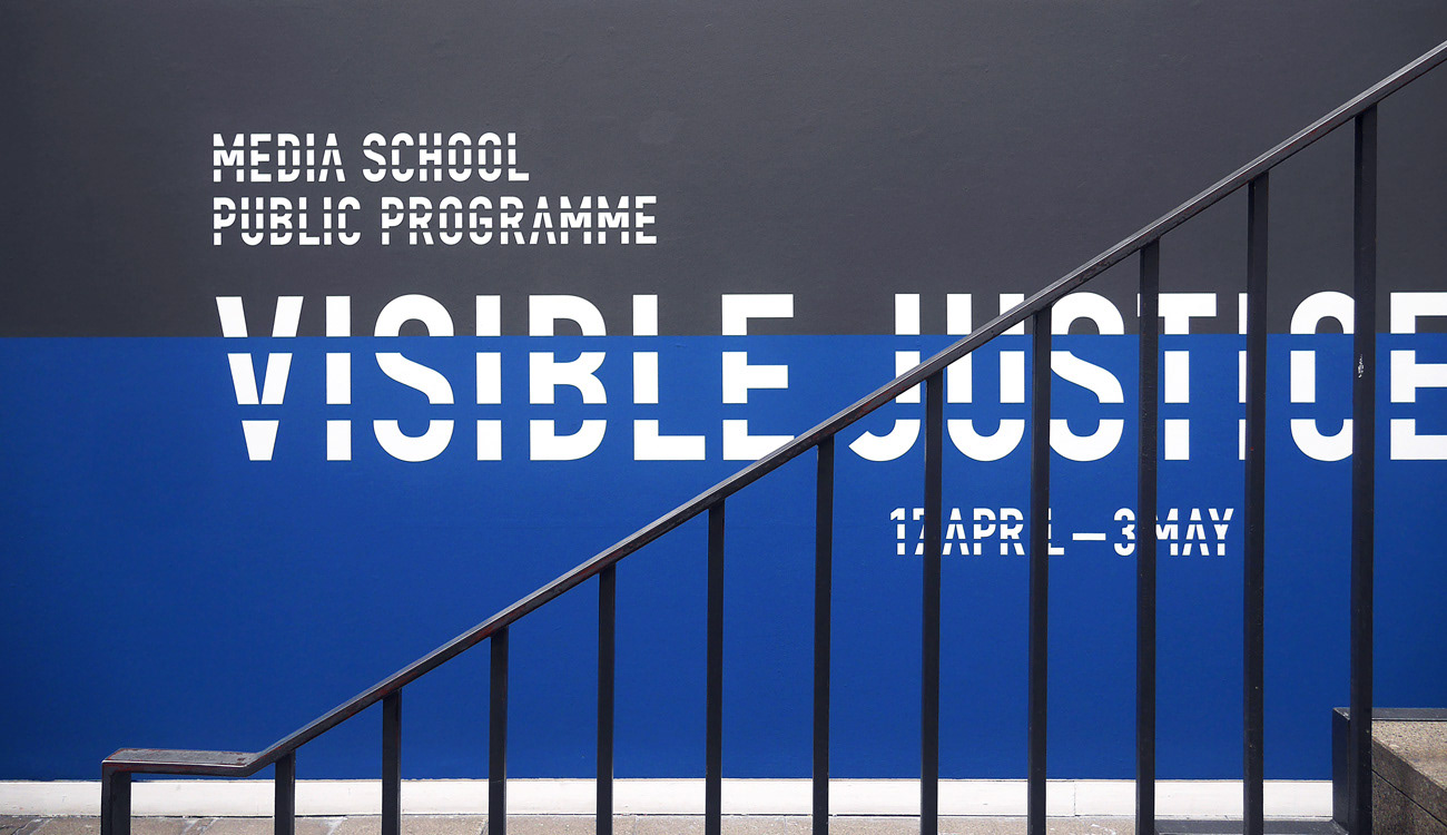
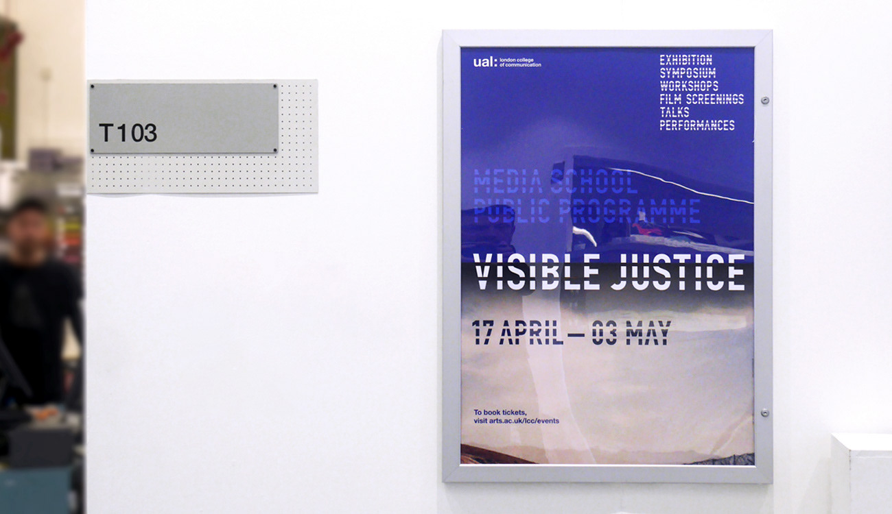
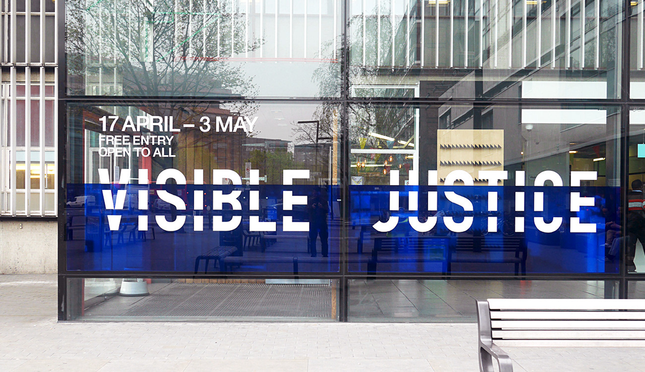
Brand identity design for the Visible Justice exhibition at UAL. The show provides a platform for artists, activists, journalists, human rights lawyers and civil liberties organisations working at the intersection between visual culture and social justice.
_
—
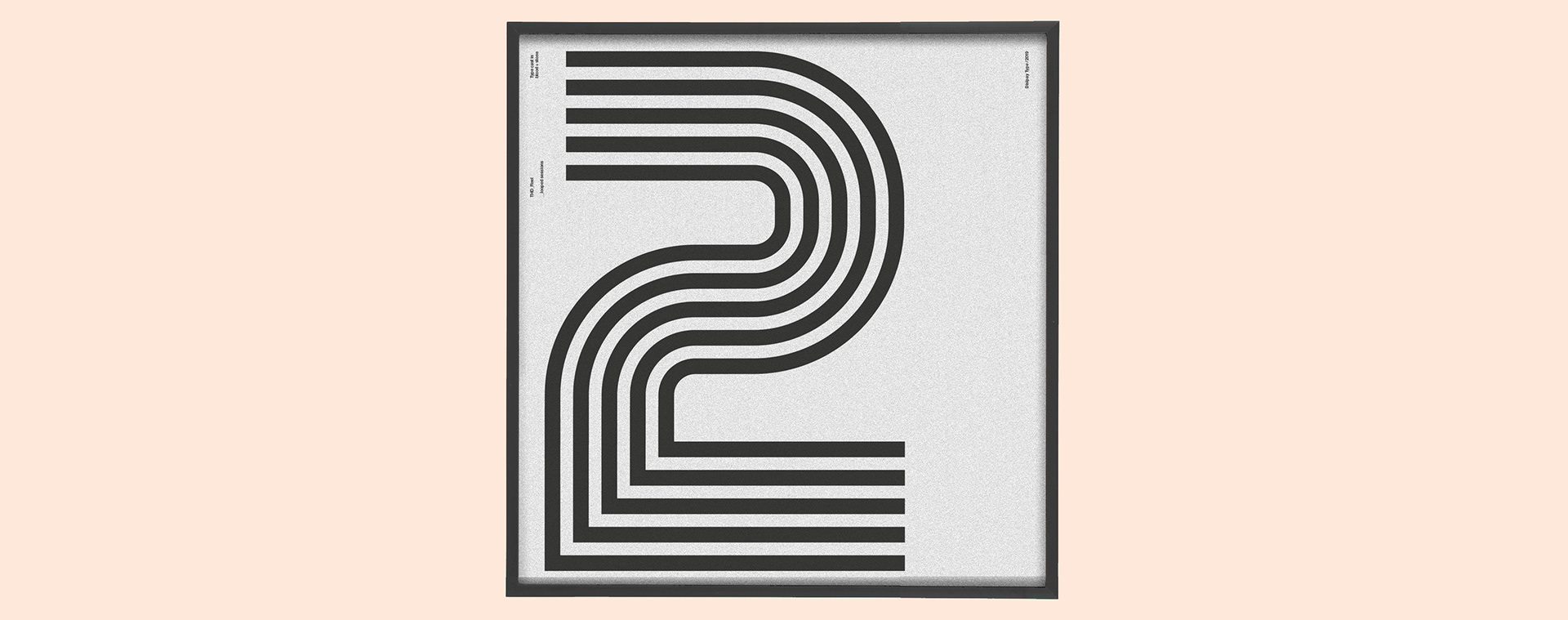
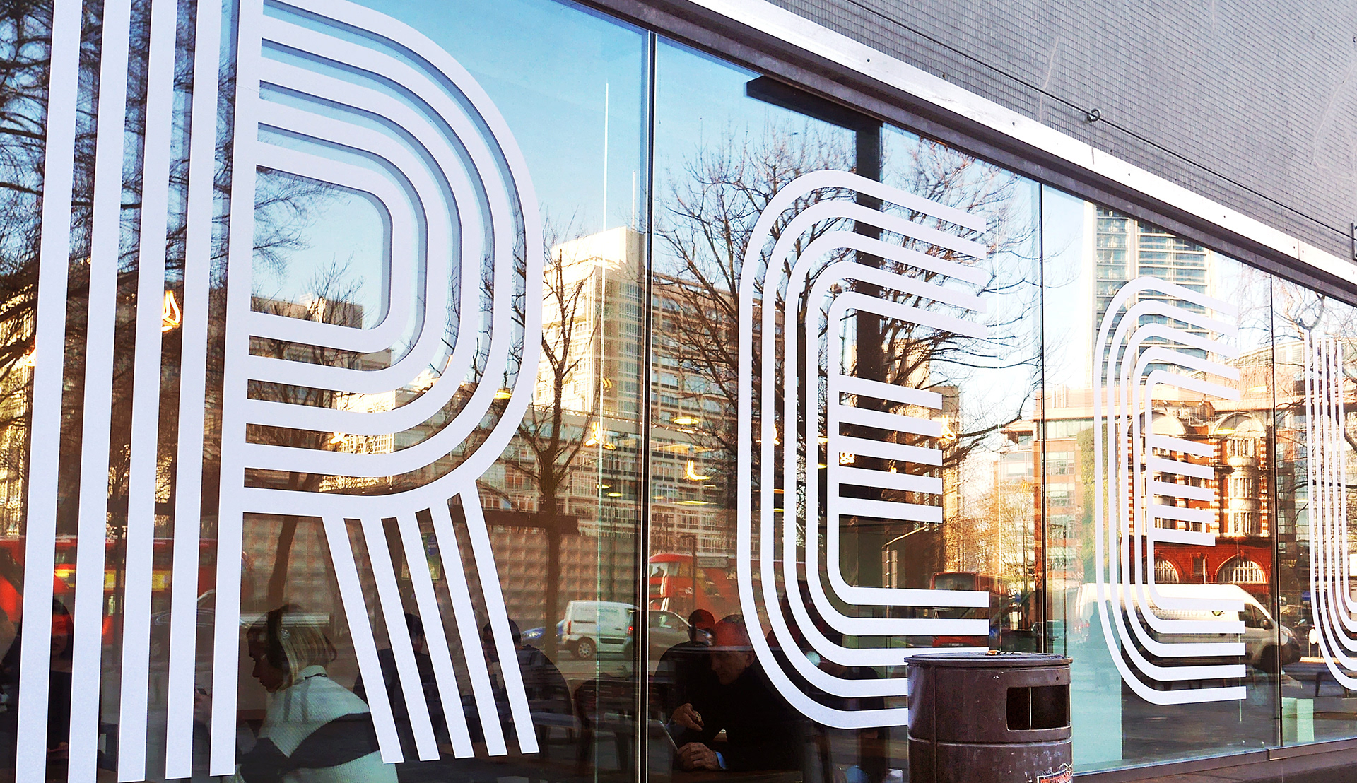
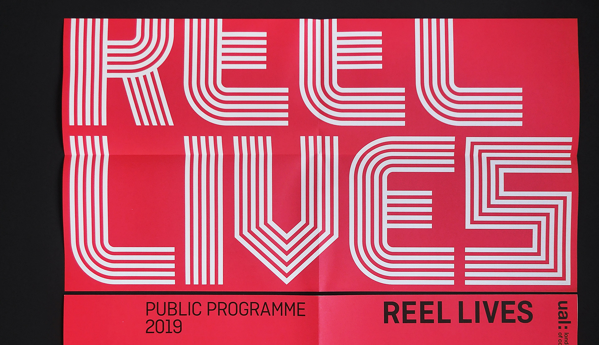
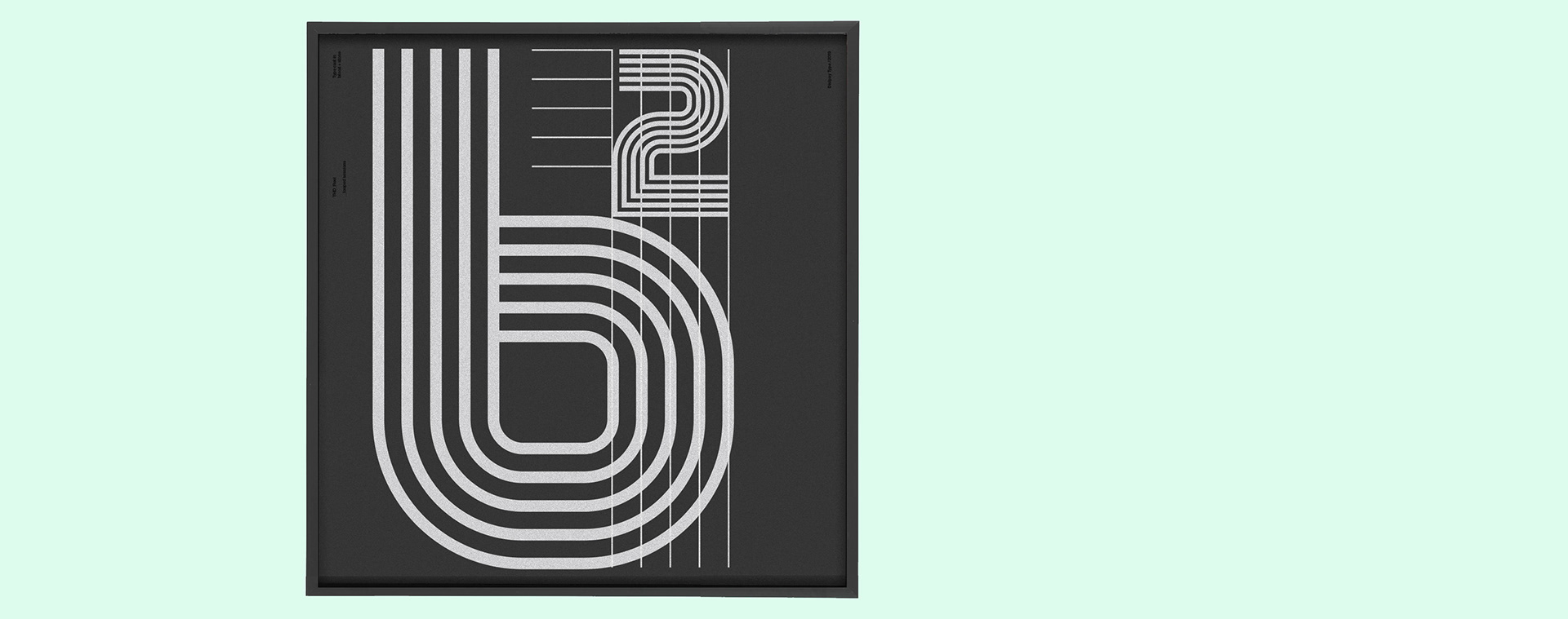
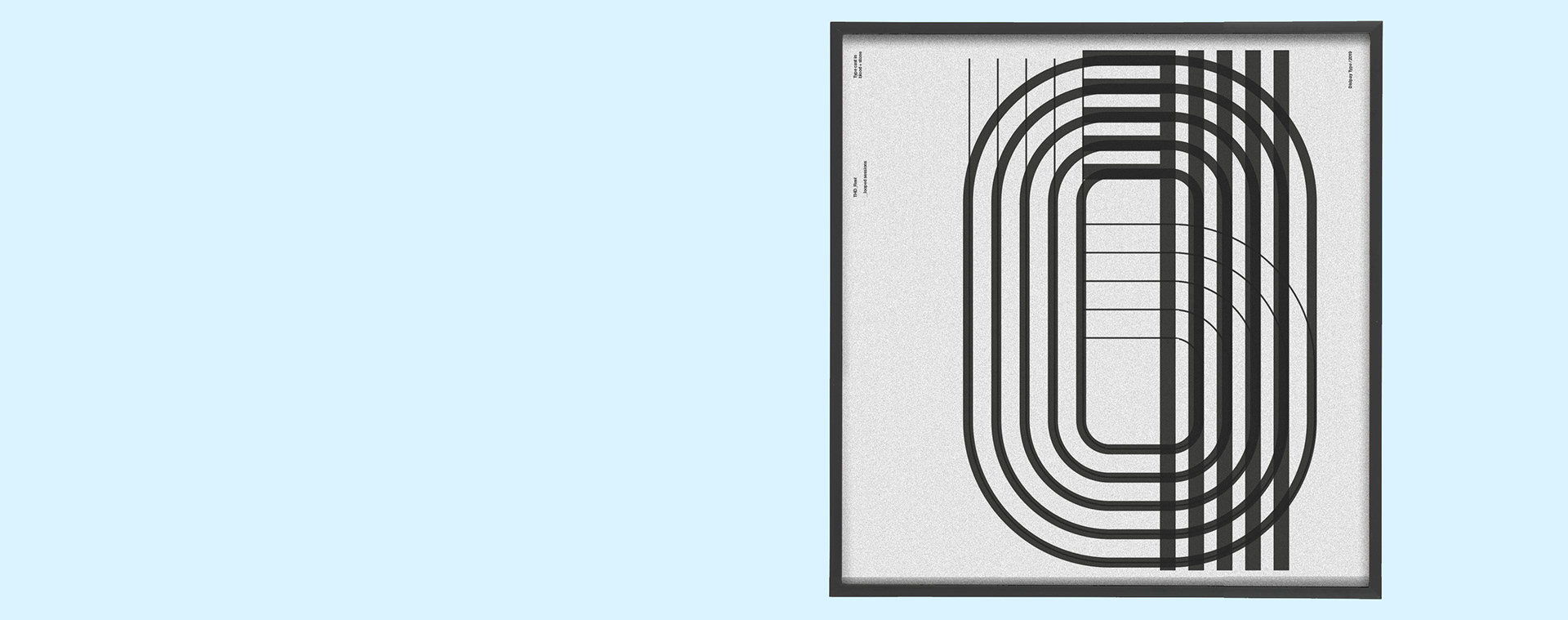
THD_Reel
Sample prints of the bespoke typeface design for the REEL LIVES 2019 film and screen exhibition identity + branding
—
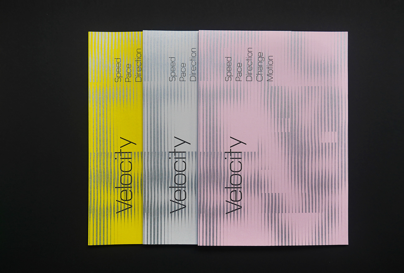
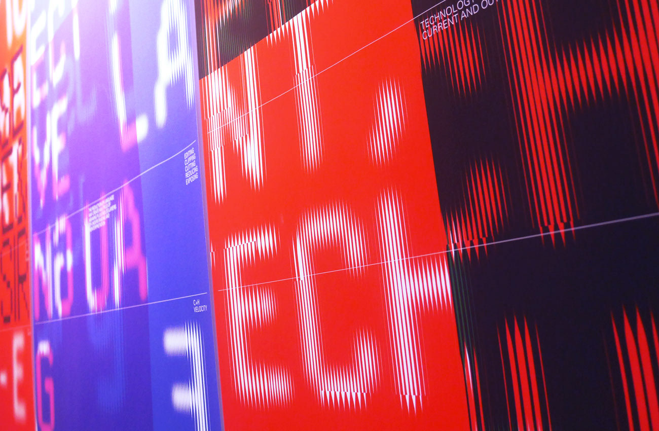
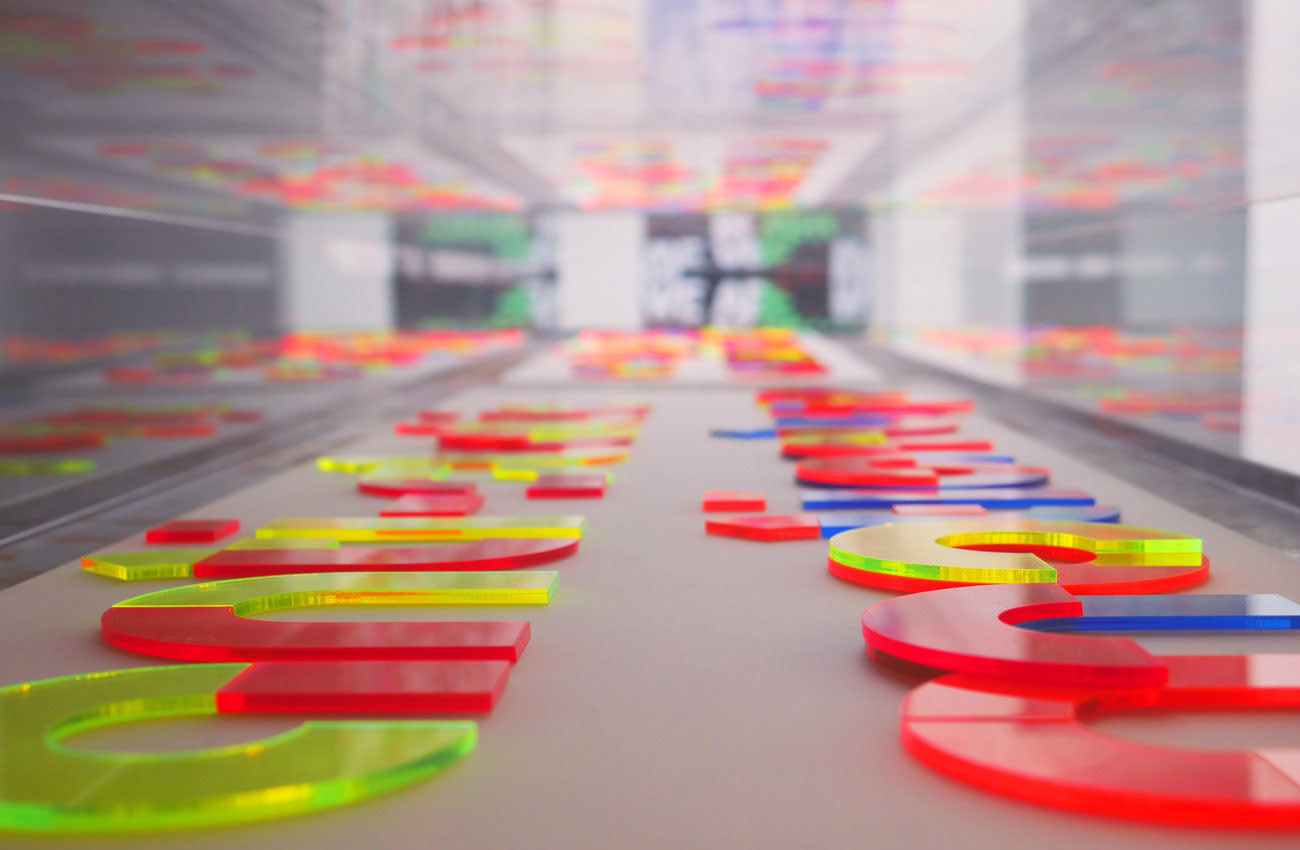
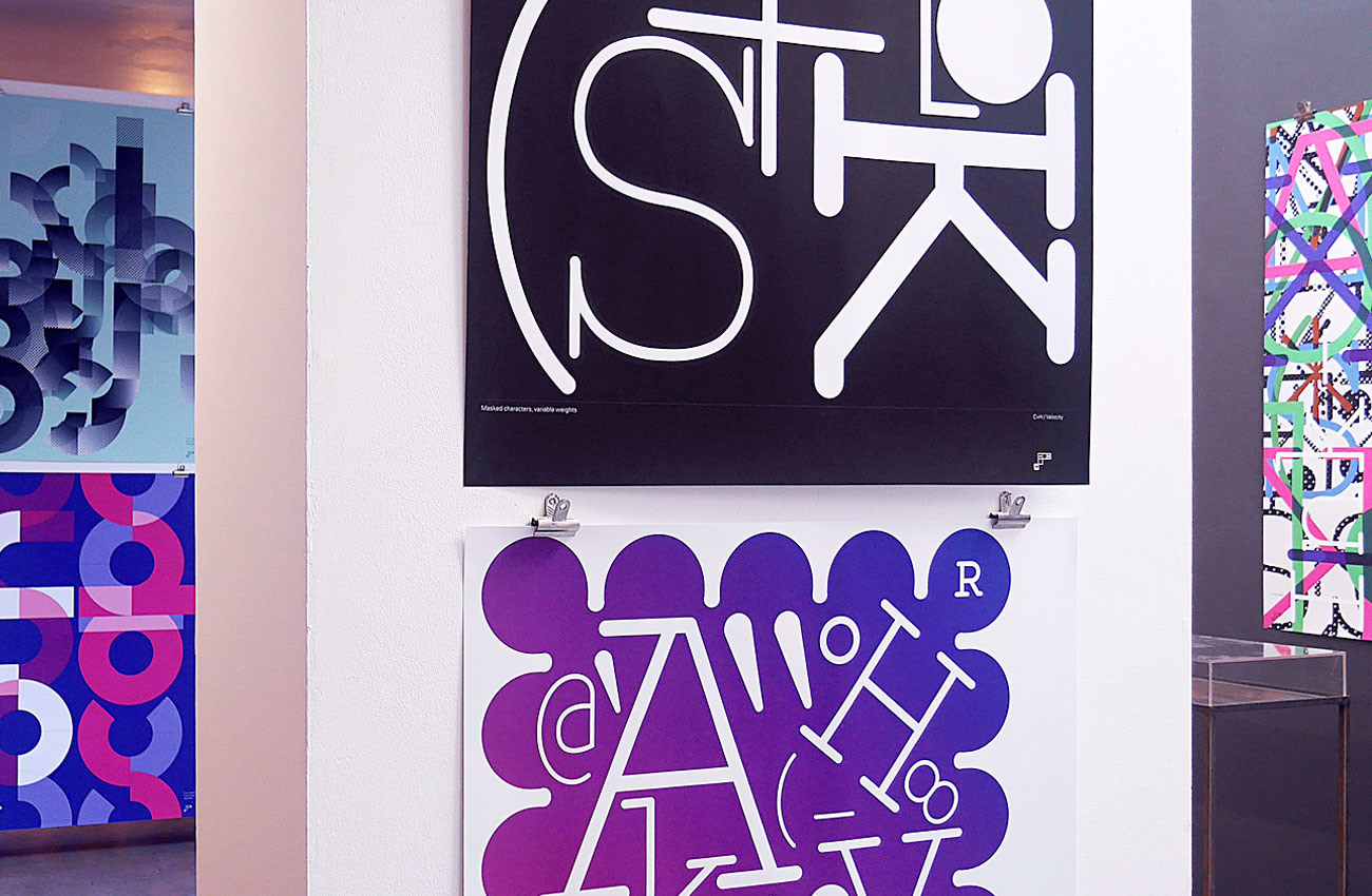
Velocity
The new publication and exhibition edited and designed by Tim Hutchinson Design + Alexander Cooper ran from 15th September—15th October 2018 at Lower Gallery, LCC. The project explores analogue and digital typographic design in response to the theme of velocity.
—
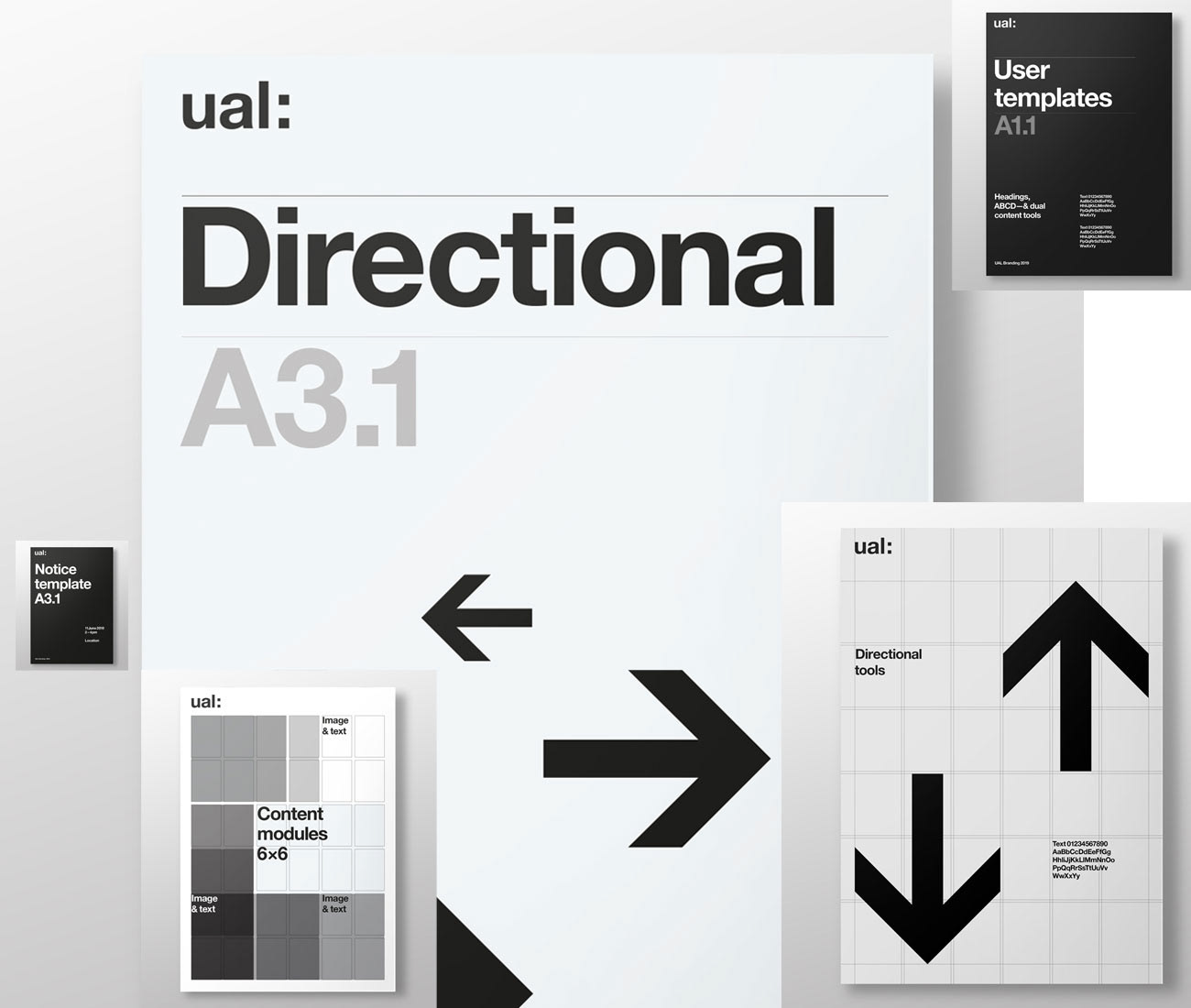
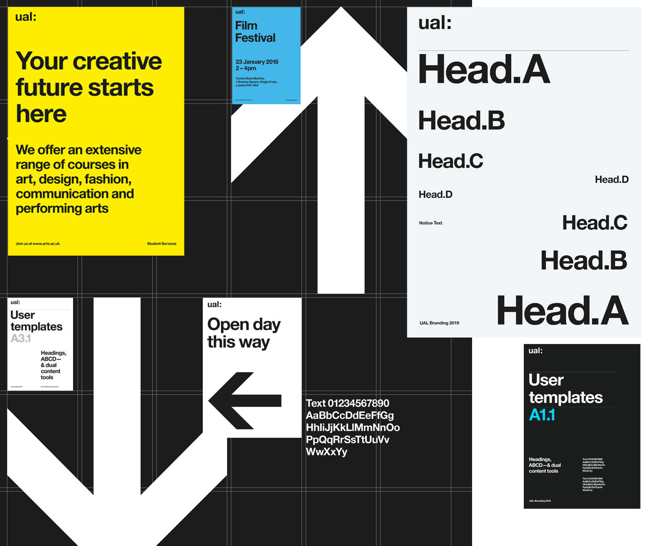
THD has completed a major process of designing a complete suite of print and digital template for UAL: This full set of over 750 individual, multi-format brand assets will be used by a diverse range of staff and agencies to ensure high quality design and typographic treatment is applied across these brand outputs. The structure of the design system is engineered from the proportions of the existing UAL: brand mark and is complemented with a proportional type scale to assist with creating balanced hierarchies of information.
Sound.Type#1 for the Velocity project. A new typeface that is continuously changing in physical and digital states.
_
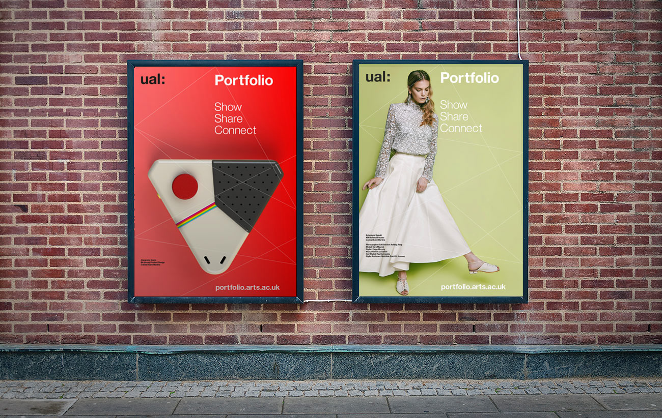
A new identity and campaign material for the new Portfolio at UAL. A platform for networking and collaborating between creatives, designers and artists.
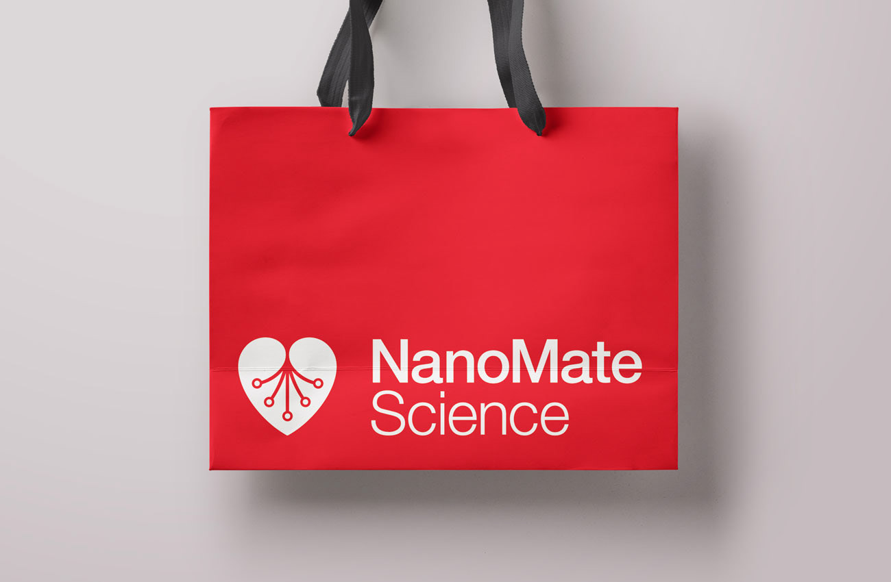
A new identity and branding applications for NanoMate research centre at the University of Glasgow.
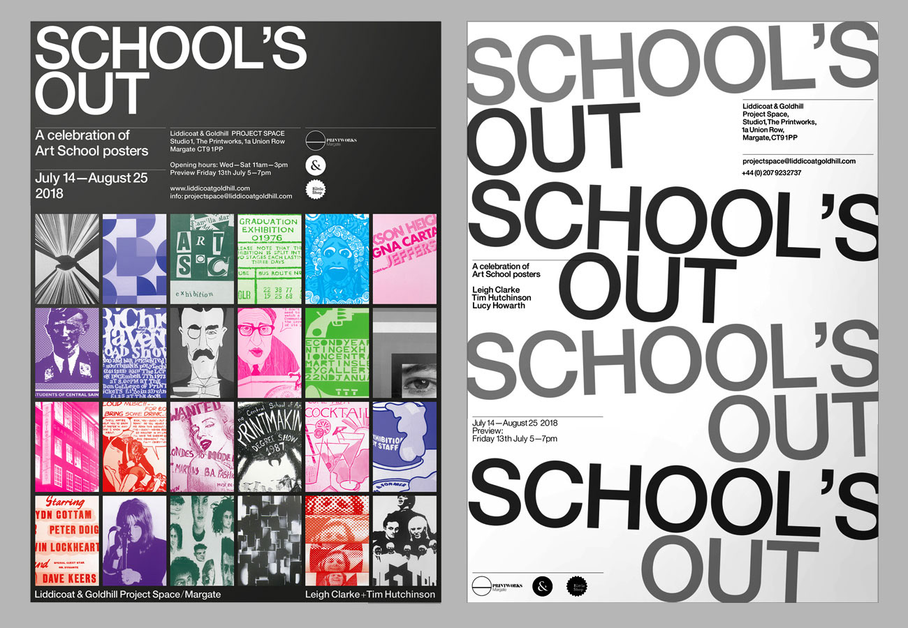
School's Out is a collaborative exhibition project between Leigh Clarke + Tim Hutchinson Design. The first show is taking place at the Liddicoat & Goldhill Project Space gallery in Margate. It will be a celebration of posters designed and produced in Art Schools form the 1950s onwards. The show is from July—August 2018. All show branding and design has been produced by Tim Hutchinson Design.
_
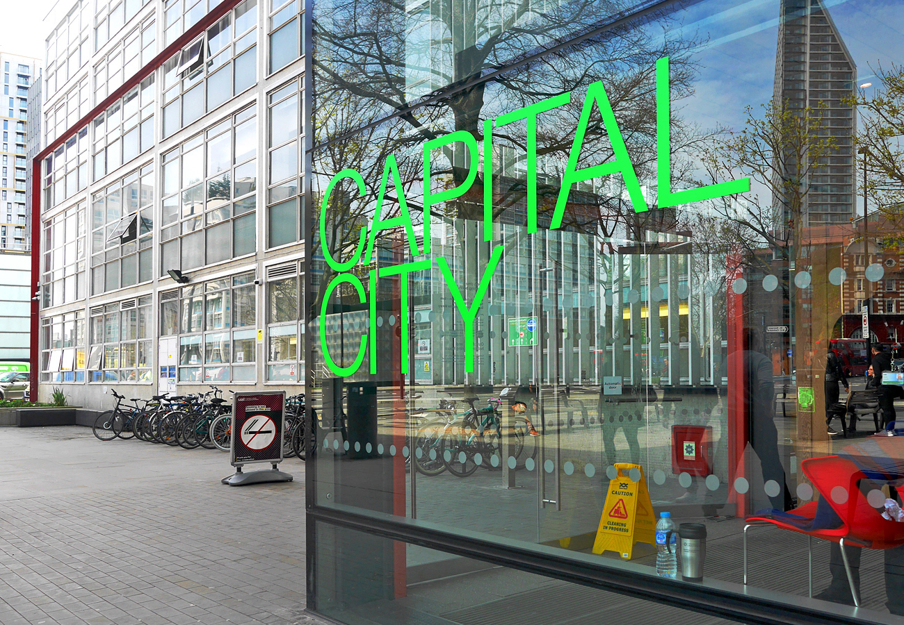
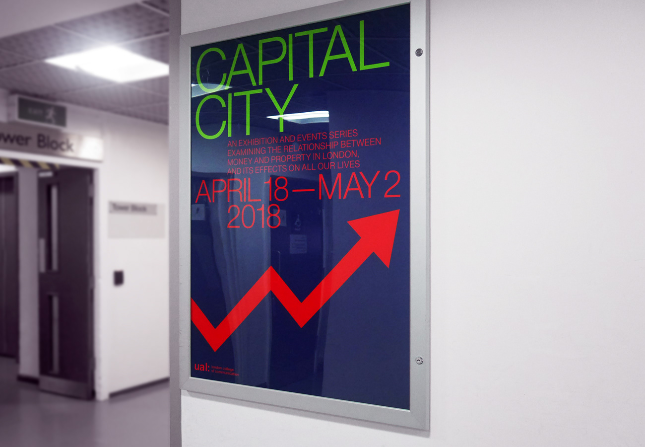
Identity, branding and editorial design for Capital City exhibition that examines the current relationship between money and property in London—featuring work by KennardPhillipps
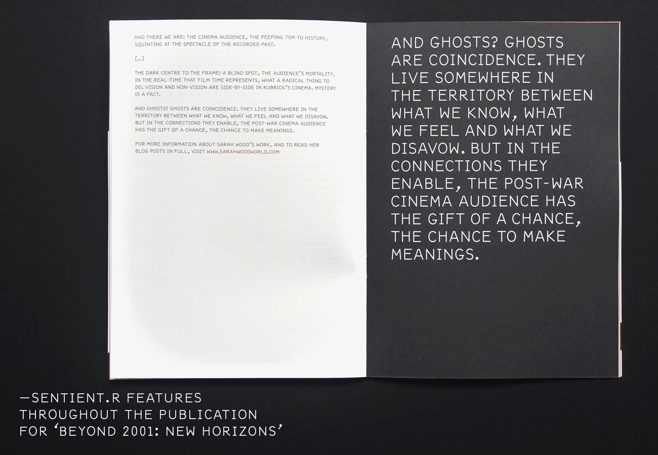
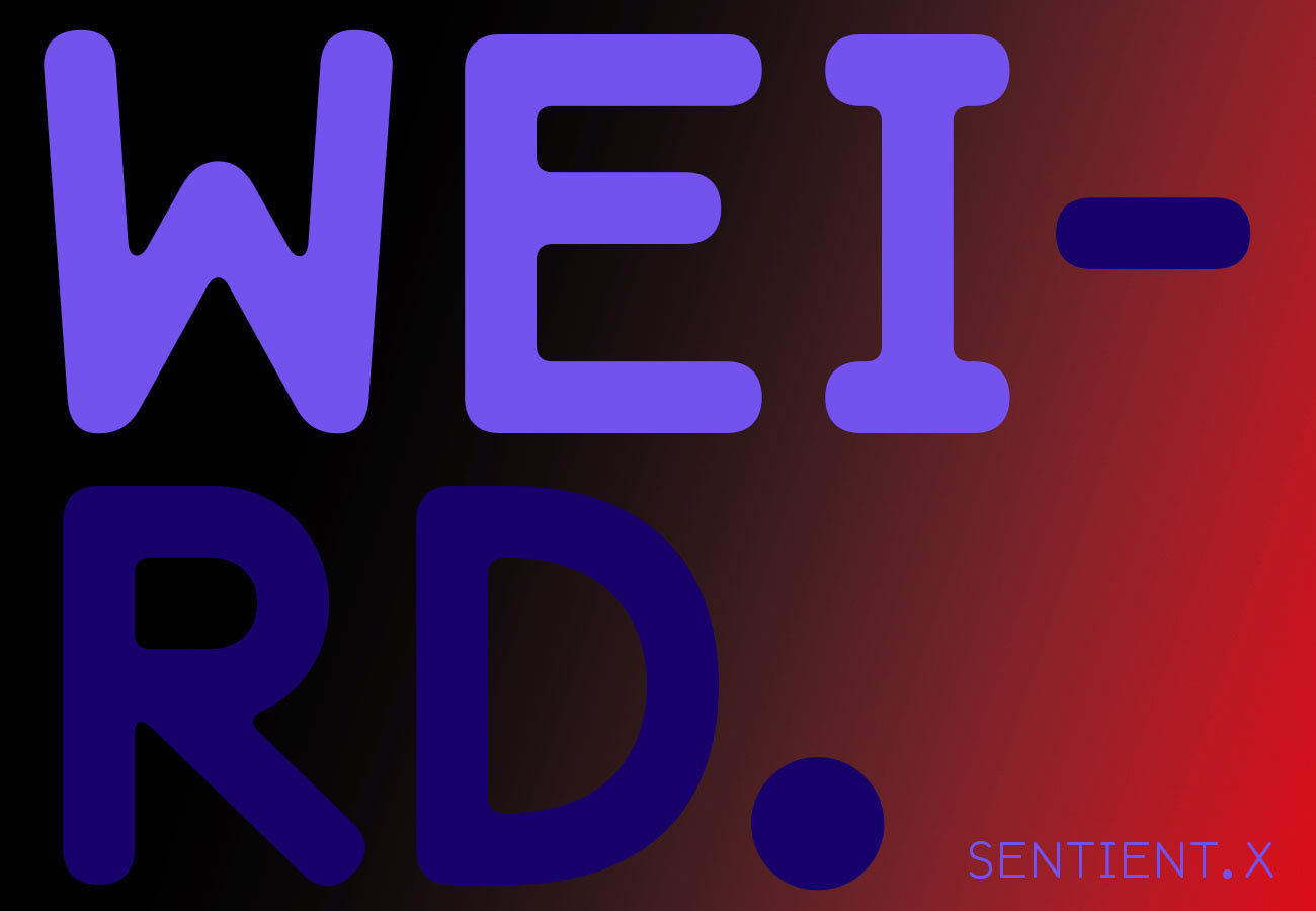
THD_Sentient is now available for purchase from www.muirmcneil.com
*****
.
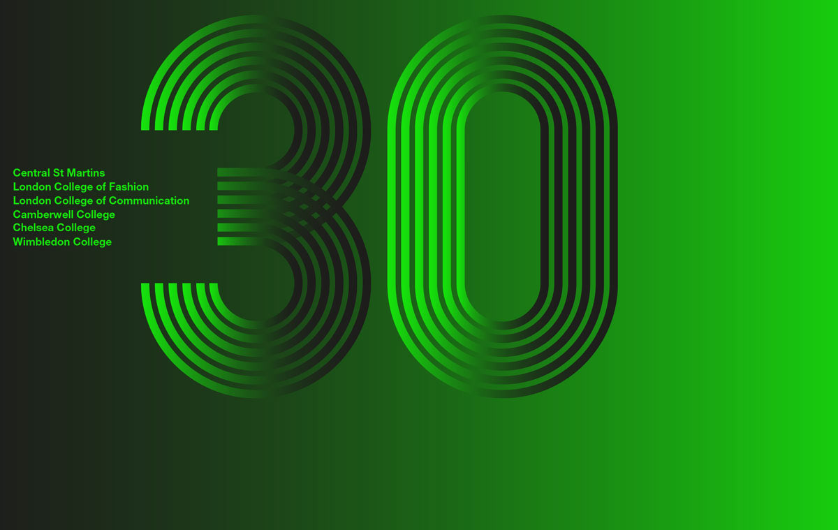
'30 years on' campaign identity image for UAL incorporating all six sites
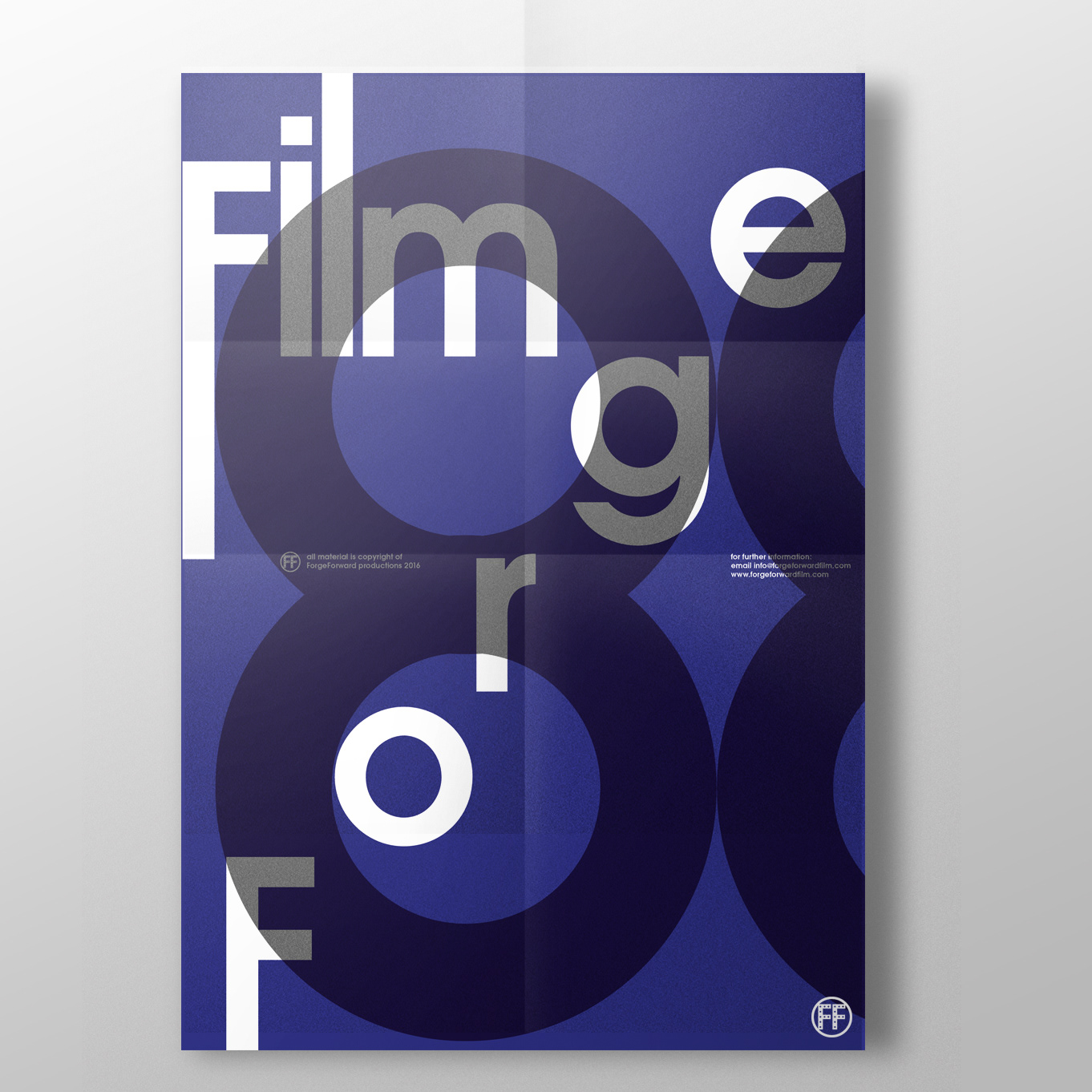
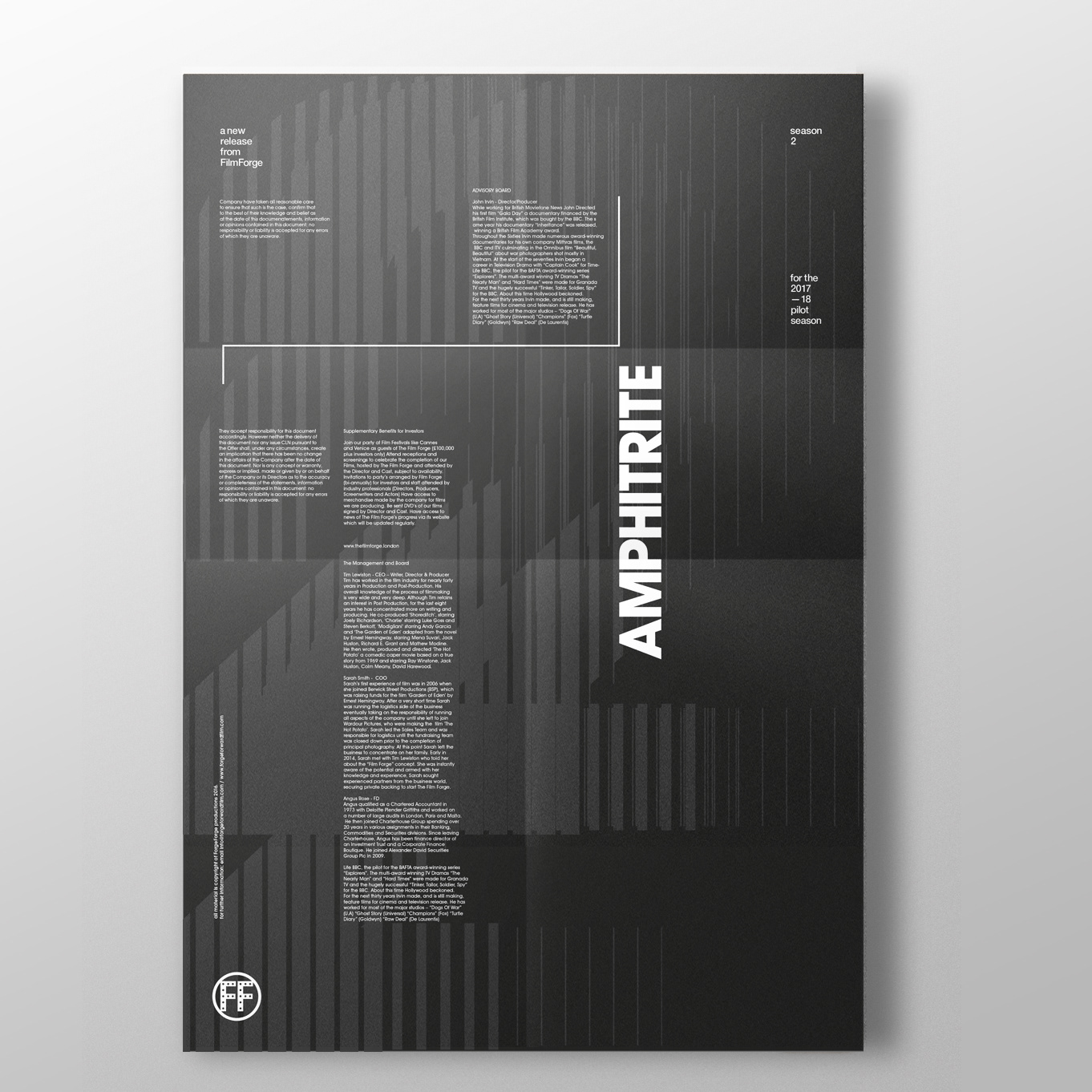
Promotional brand development for FilmForge—release information brochure cover for new films
Invitation cover designs for the annual Cudlipp lecture series at UAL—the use of initials plus strong colour set a vivid identity for each keynote speaker and their identity is revealed on the reverse.
—
—
A new season and a new range of 'messaging' poster for LCC
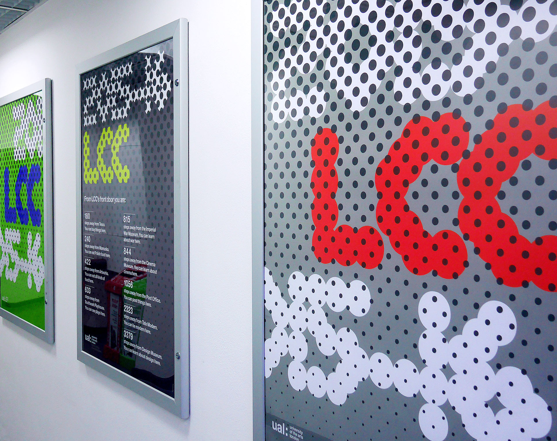
The new, brighter guide to all courses at LCC—with new abstract graphic representations of the architecture and environment.
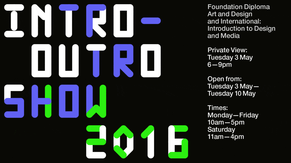
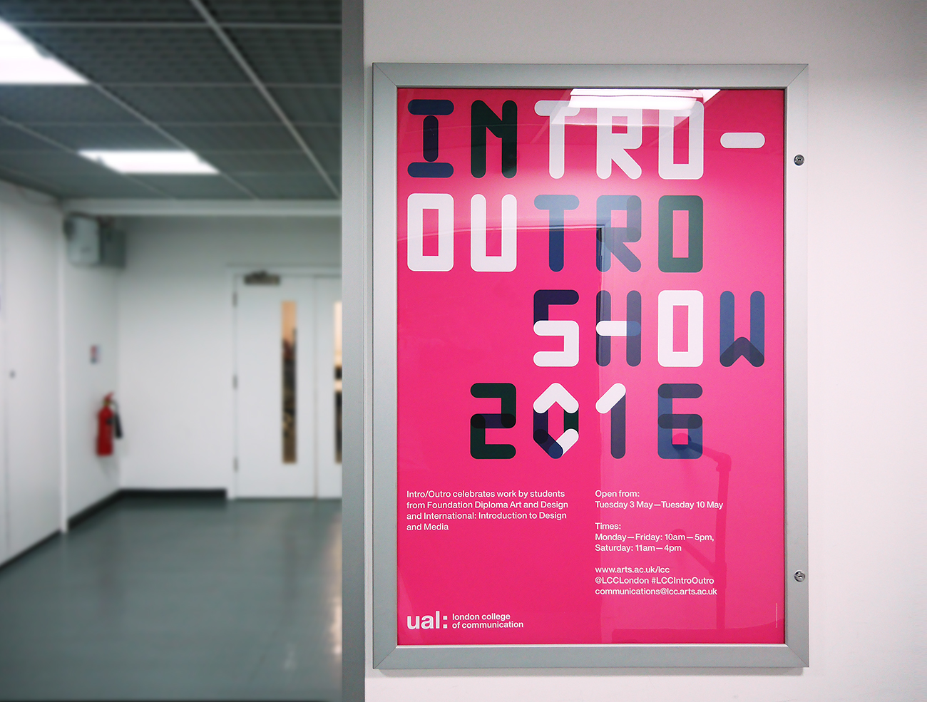
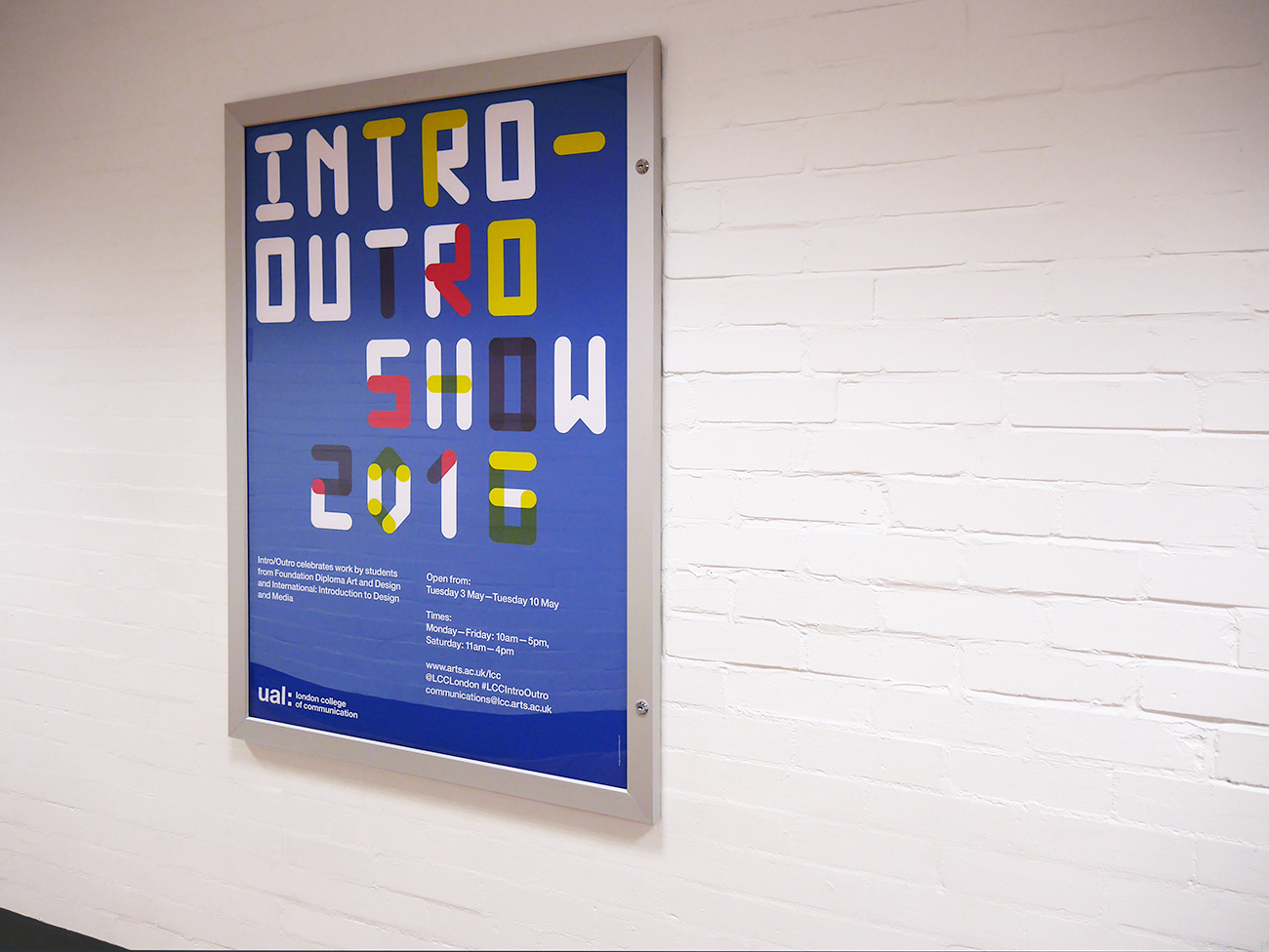
This is one of our animations for the new 2016 INTRO–OUTRO show at LCC. The animations are featured around the galleries providing information on the show along with with posters promoting associated events.
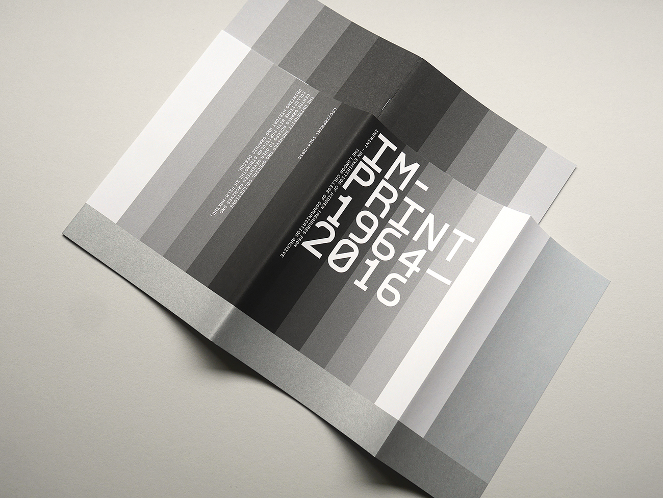
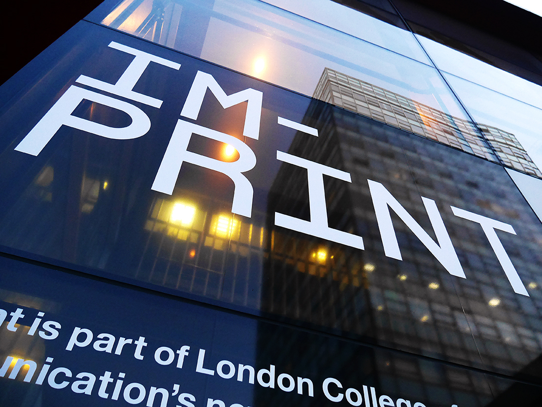
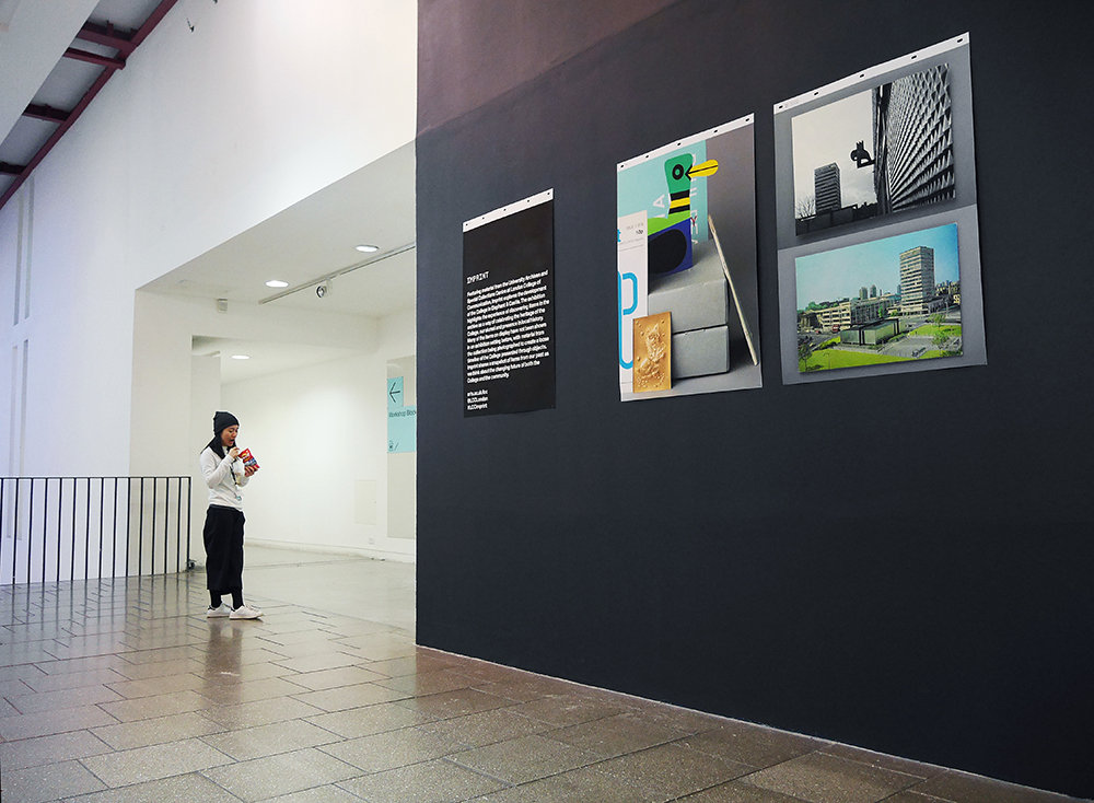
We have just completed the art direction and design for a major exhibition, 'Imprint' in the main galleries at LCC. The show presents many treasures that have been stored within the archives from 1964—2016. The show articulates the development of the College within the environment and shows a fascinating visual timeline of design development during this period. The intended audience is the general public and launches an important Public Programme of events to link the LCC with the local community—it is free and open to all.
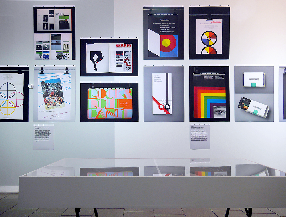
Gallery image, showing design work from the 1970s
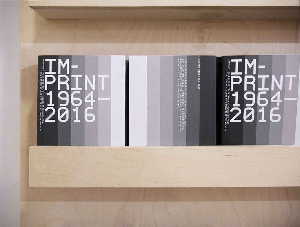
Exhibition catalogue—we created a visual narrative of the decades throughout the publication with images of design work and local documentary photographs sourced form the archive that linked with a continuous essay within.
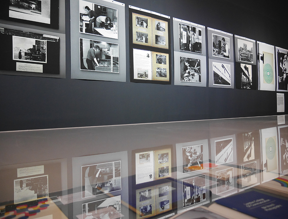
Gallery image—showing documentary photography and visual records form the 1960s. The colour tones of the walls change across the gallery as the work moves forwards through the decades towards the present.
_

_
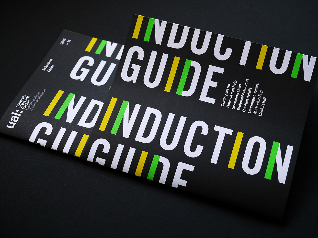
The latest student Induction Guide for LCC